Case study
Viewpost
Four design projects across a B2B payments platform, each tackling a different source of cognitive load or anxiety in the workflows of accounts payable and receivable users.
Viewpost helps small and large businesses see their money by making invoicing, payments, and cash flow transparent across organizations. As one of three product designers on the team, I worked on four scoped projects spanning the platform. Each tackled a specific friction point that surfaced from user research or customer service data, and each shared a throughline: removing cognitive load and surfacing information users couldn't see before.
Project 01
Viewpost Sync 2.0: Linking Viewpost to the ERP
The problem
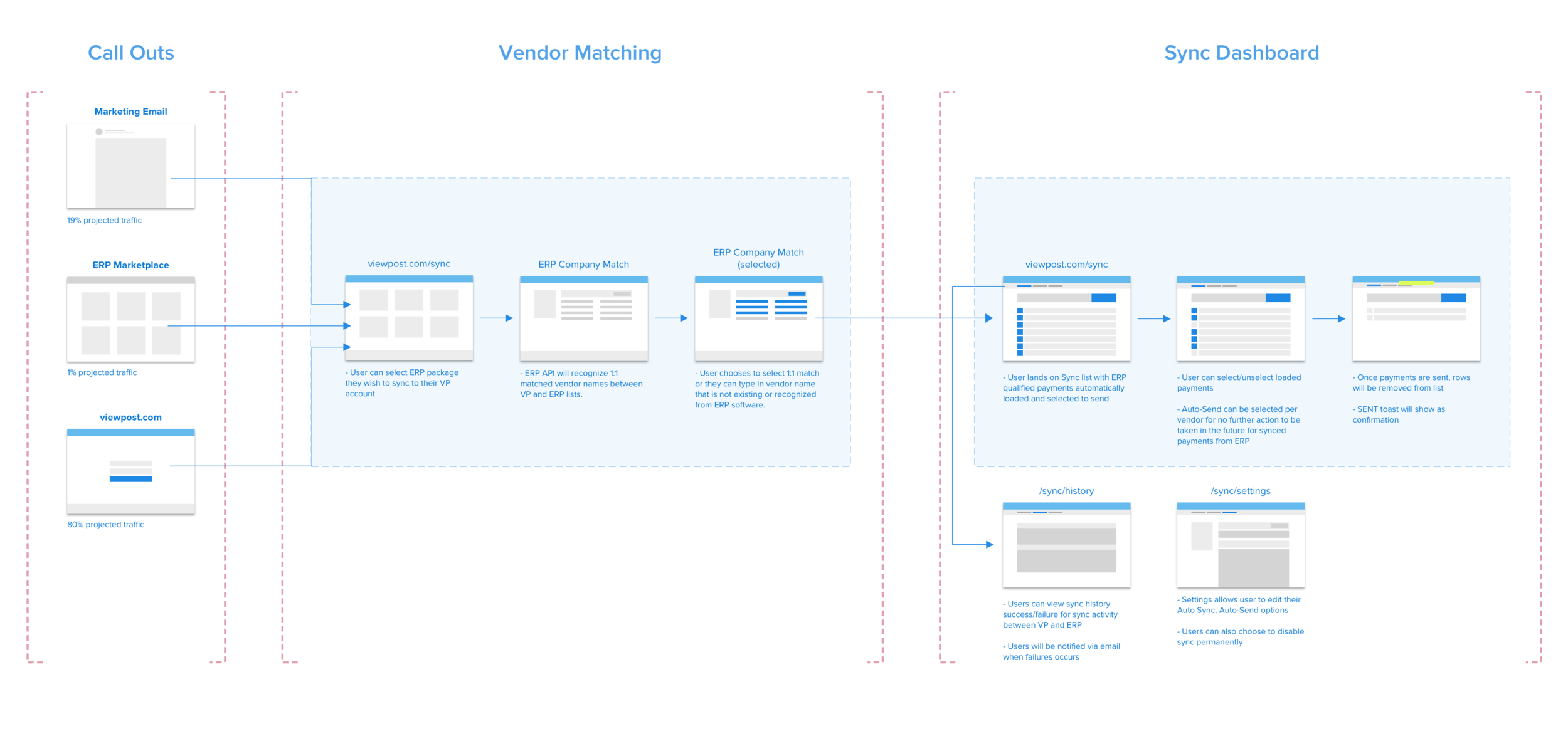
Customer Experience interviews with Accounts Payable users surfaced a recurring friction point: people paying bills through Viewpost were also re-entering the same payment data into their accounting software (their ERP). The duplicate work was tedious in isolation and exhausting in repetition across a workday. Users consistently described it as one of the most frustrating parts of their job.
The approach
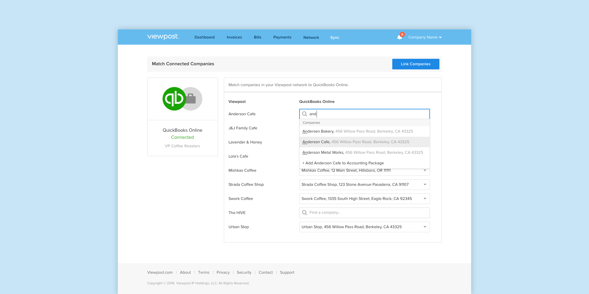
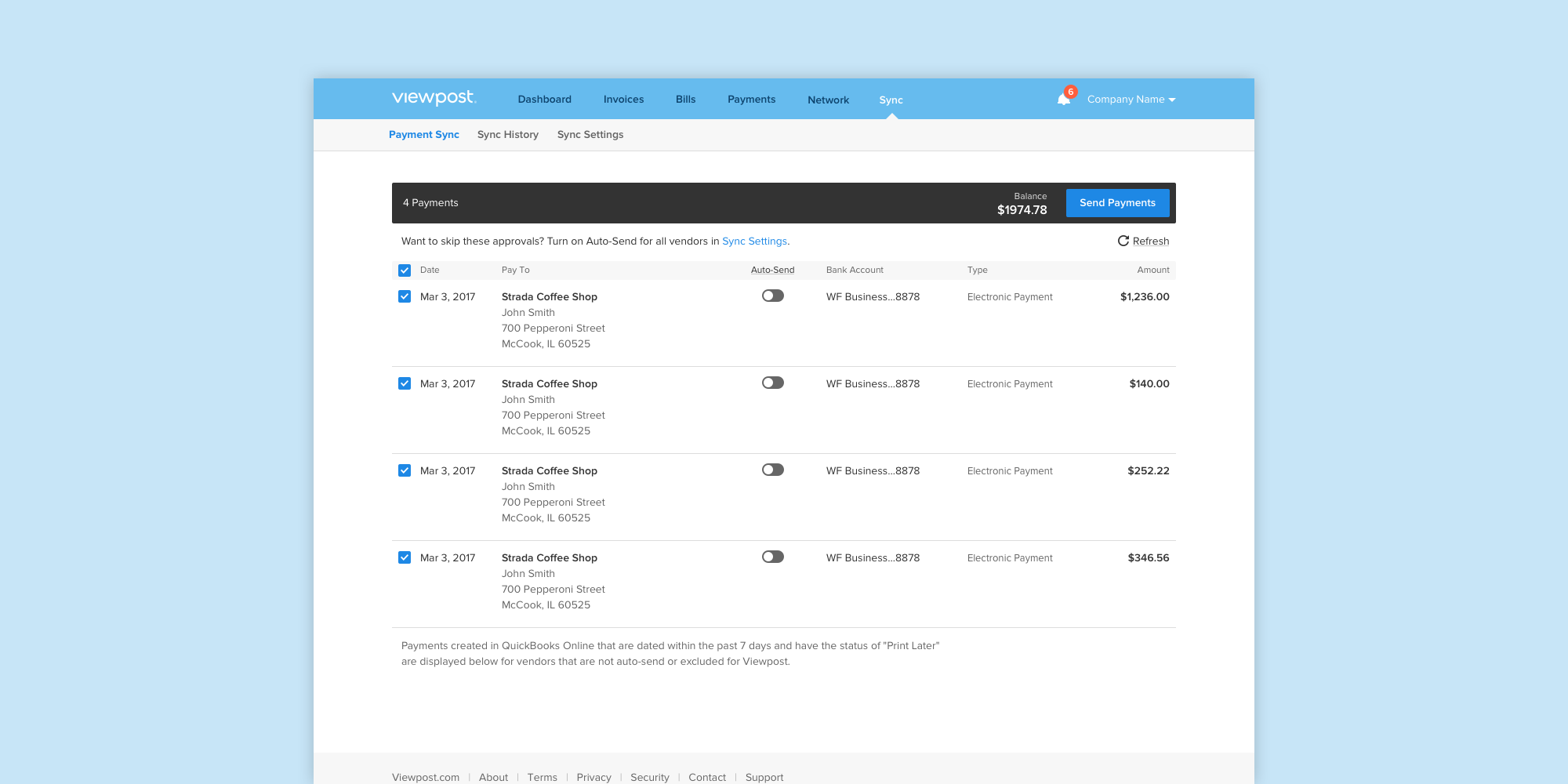
The team's priority was reducing the cognitive load of operating across two systems at once. I mapped the cross-platform workflow end-to-end, from the entry points users would use to discover Sync, through the vendor-matching step that aligned company records between Viewpost and the ERP, into the Sync dashboard where payments could be reviewed and sent. After aligning with stakeholders on the proposed flow, I built and tested wireframe prototypes through several iterations before handing off to UI for visual design.
Project 02
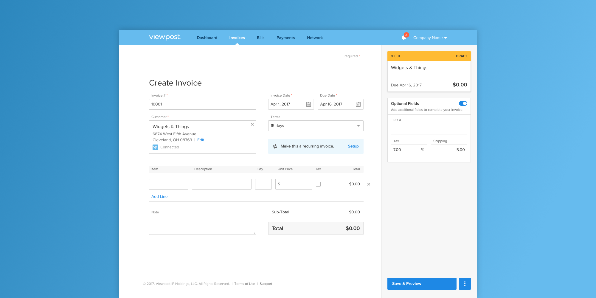
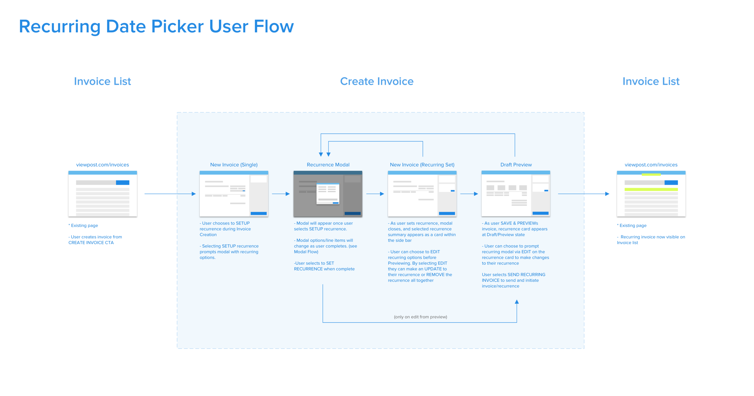
Recurring Invoices: Advanced Options
The problem
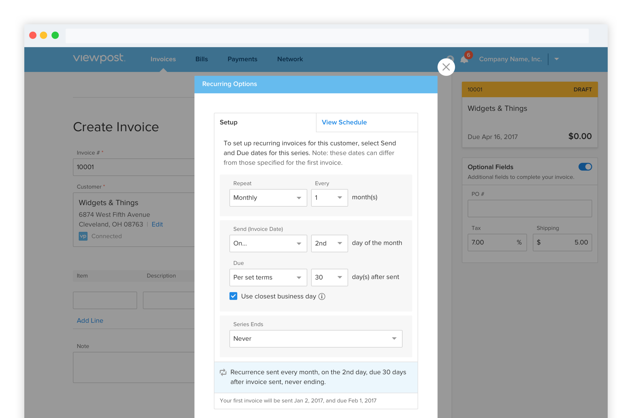
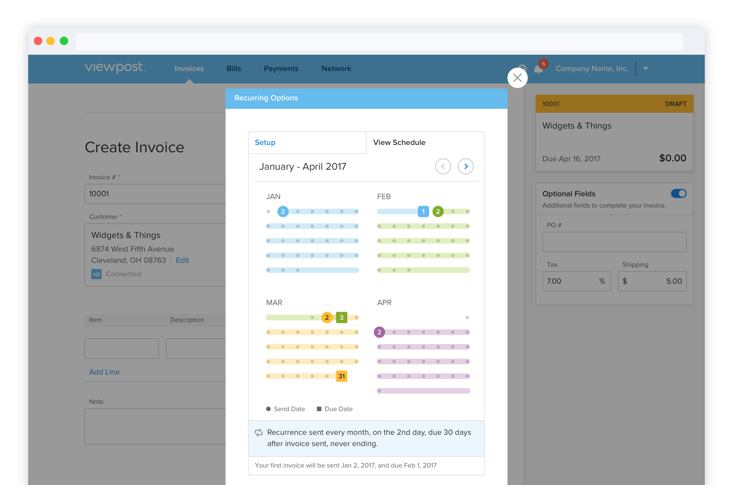
Accounts Receivable users wanted more granular control over how their recurring invoices were scheduled, but the existing flow forced a one-size-fits-all approach. Without the ability to customize, users were either avoiding the feature or making scheduling errors that created downstream rework.
The approach
The design needed to do two things at once: give users the flexibility to fit recurring invoices to their actual billing cadence, and visualize the resulting schedule clearly enough to catch errors before they shipped. I iterated on patterns for selecting, reviewing, and previewing, splitting the experience into a Setup tab for configuration and a View Schedule tab where users could see exactly when invoices would send across the coming months.
Project 03
Payment Tracker
The problem
Over 30% of inbound customer service calls came down to a single question: "Where's my money?" Users on both sides of a transaction (Accounts Payable and Accounts Receivable) couldn't see where a payment was in its lifecycle, and that opacity drove both anxiety and support volume.
The approach
I joined customer service shadowing sessions and ran user interviews to map exactly which moments of the payment journey were the most opaque. The team documented every possible payment status across both AP and AR perspectives, then iterated on UI patterns to find a single tracking module that could communicate status simply, including the two states that mattered most: a clean delivery path with intermediate milestones, and an exception state when a payment couldn't complete.
Project 04
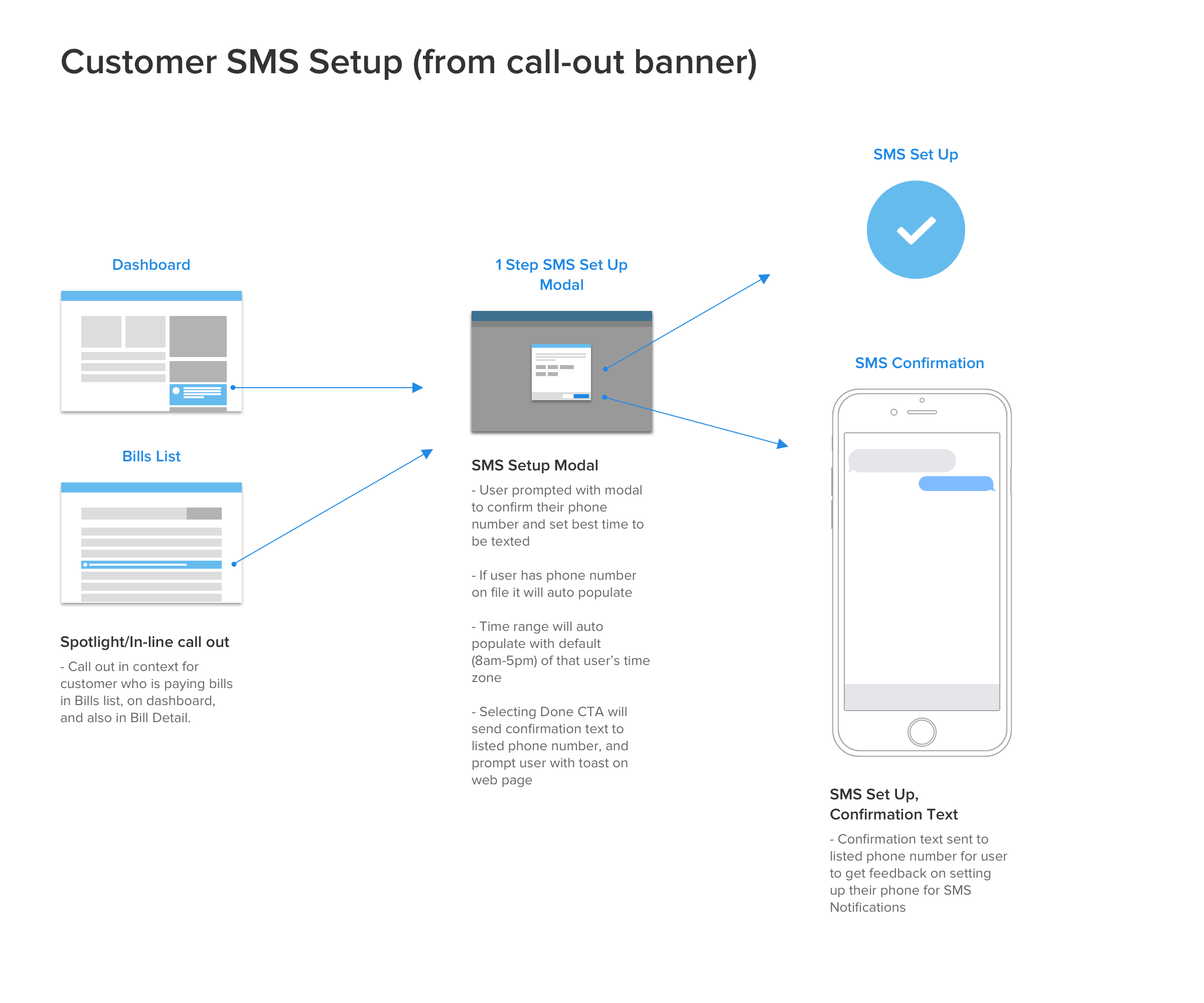
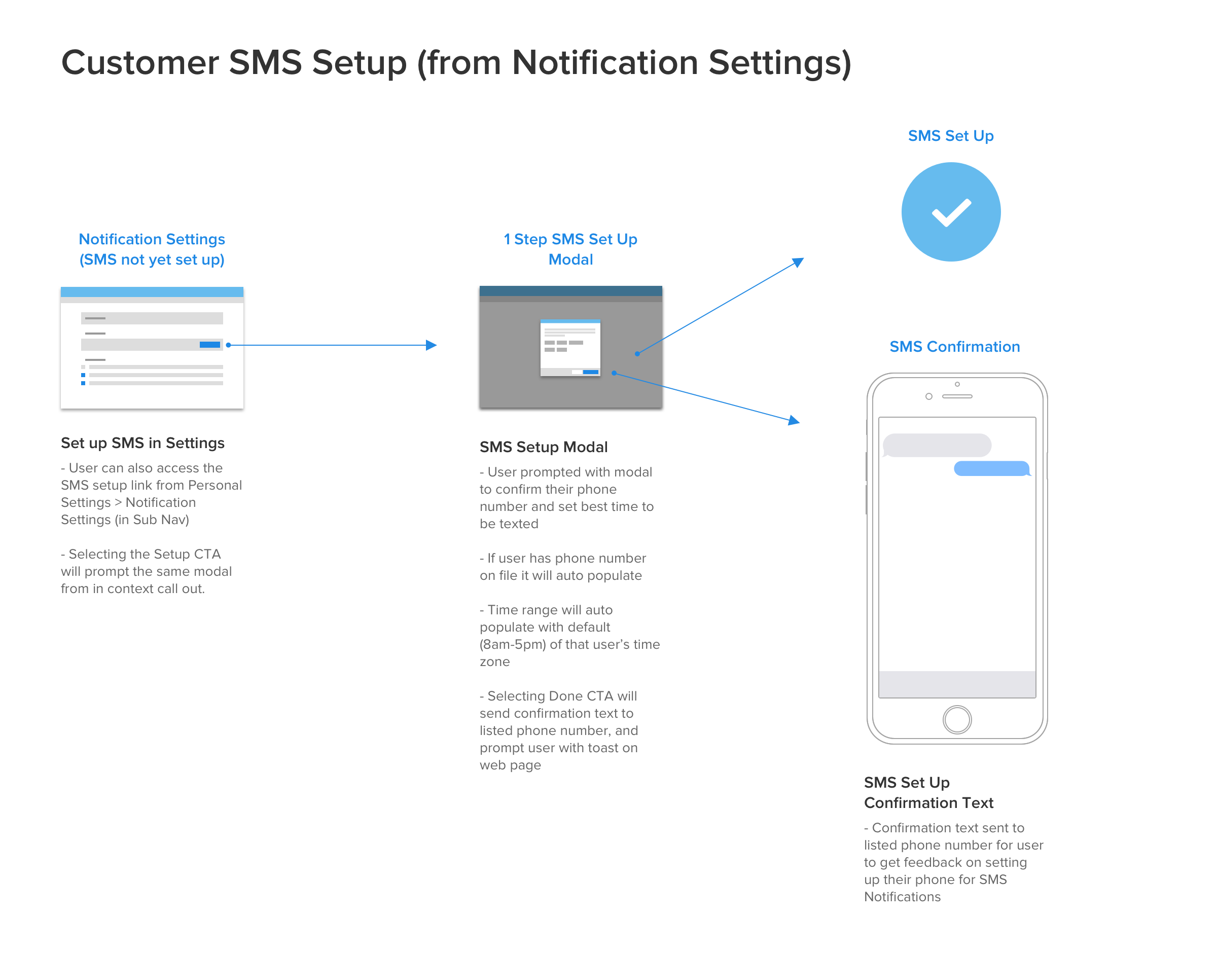
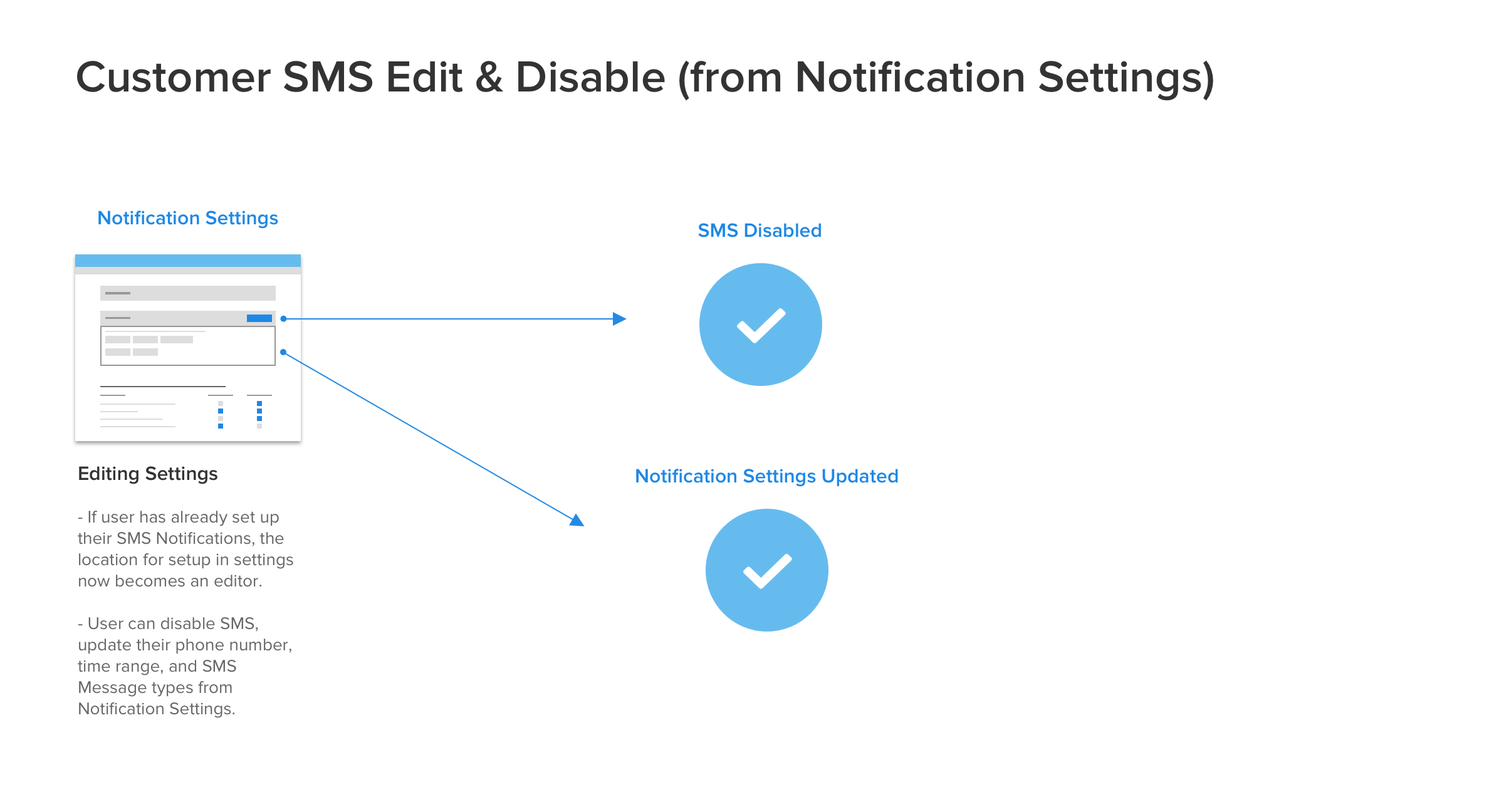
Exploring SMS Notifications
The problem
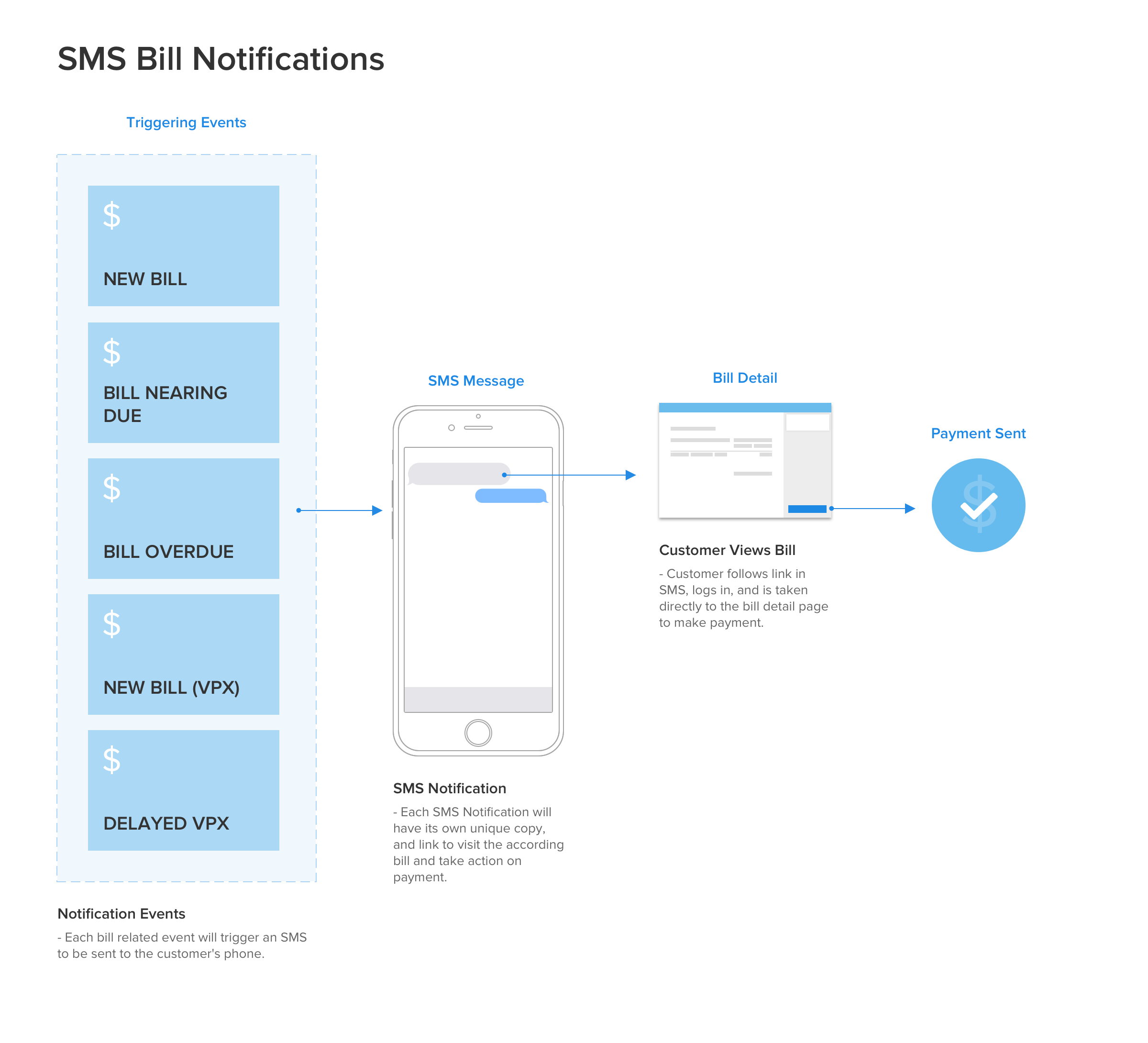
Time-sensitive moments in the payment cycle (incoming bills, expiring discount offers, status changes) were getting lost in email noise. Accounts Payable users were missing windows for action that mattered to their bottom line, and the product team wanted to explore whether SMS could close that gap.
The approach
This project was an exploration more than a ship: I mapped the space across three layers: the triggering events that would generate SMS messages, the in-app call-outs that would introduce SMS to users, and the granular notification settings users would need to control what they received. Sketching and wireframing each layer let the team scope what was essential for V1 and what could wait for V2.
What this work reinforced
The four projects looked different on the surface (an ERP integration, an advanced scheduling UI, a payment tracker, a notification system), but they all answered the same underlying question: what is the user trying to know, and why can't they see it yet?
Whether the friction came from data living in two places (Sync), inflexibility in a single feature (Recurring), opacity in a process (Payment Tracker), or the wrong channel for the message (SMS), the design work was about closing a gap between the user's mental model and what the product could show them. That framing has stayed useful to me on every team I've worked on since.