Case study
Pinch Rent
Redesigning a rent-payment app to remove friction from account setup, navigation, and monthly payments across iOS and Android.
Pinch helps home renters build credit through their monthly housing payments, turning a routine expense into financial progress. Working with the founding team during a product pivot, I led the UX redesign across iOS and Android, focused on three challenges that were quietly suppressing the product's potential: account creation that lost users before they got started, navigation that buried the features people needed most, and a payment experience that left renters anxious about whether their money had arrived.
Starting from existing research
Pinch had been live long enough to accumulate real user signals from qualitative interviews, support ticket trends, and analytics showing where users were dropping off. Stakeholders walked me through what they'd learned, and three patterns kept surfacing across the data: account creation was the largest funnel bottleneck, customer support was overwhelmed with questions about where common features lived in the app, and renters reported real anxiety about whether their check payments had arrived on time.
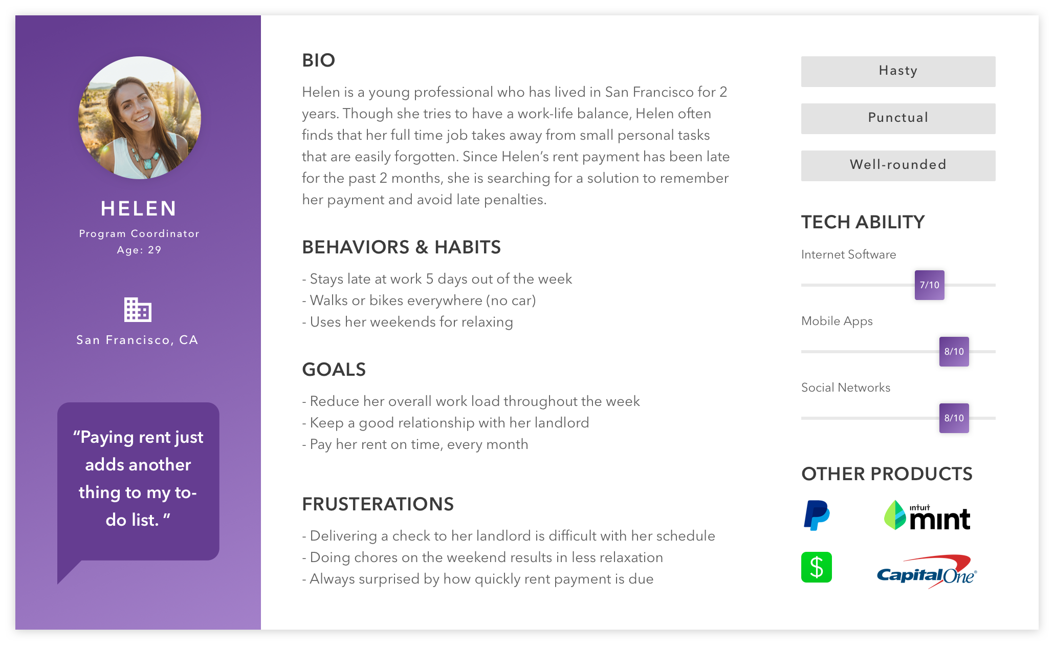
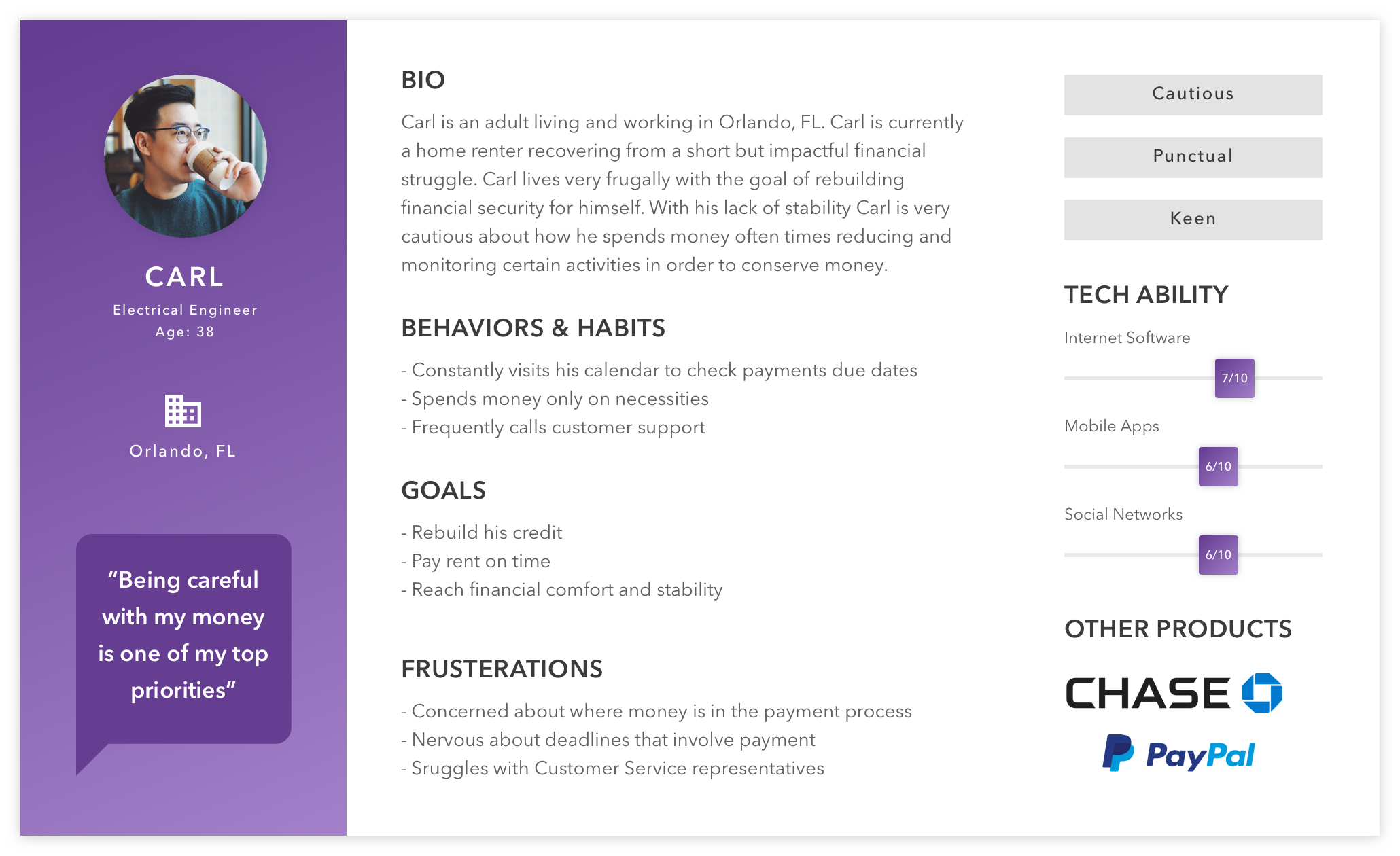
The team's research had also converged on two primary personas, both modern renters using mobile devices as their primary financial tool, but with distinct priorities around credit-building, payment flexibility, and account control. Rather than running fresh research, I worked from this existing foundation, focusing my energy on translating insights into design solutions.
Three challenges, in sequence
The redesign organized around three specific problems, each tied to a concrete user pain point. I tackled them in this order: fix the funnel first, make the product easier to navigate once users were in, then improve the recurring monthly experience.
1. Account setup was losing users before they could schedule a payment.
The single biggest drop-off in the funnel happened before users ever saw the core product.
2. The features people needed most were the hardest to find.
Customer support was fielding a steady stream of "where do I find X" tickets, a clear signal the IA was working against users.
3. Monthly payments left renters uncertain.
Two distinct anxieties: remembering to pay, and tracking the money once it left.
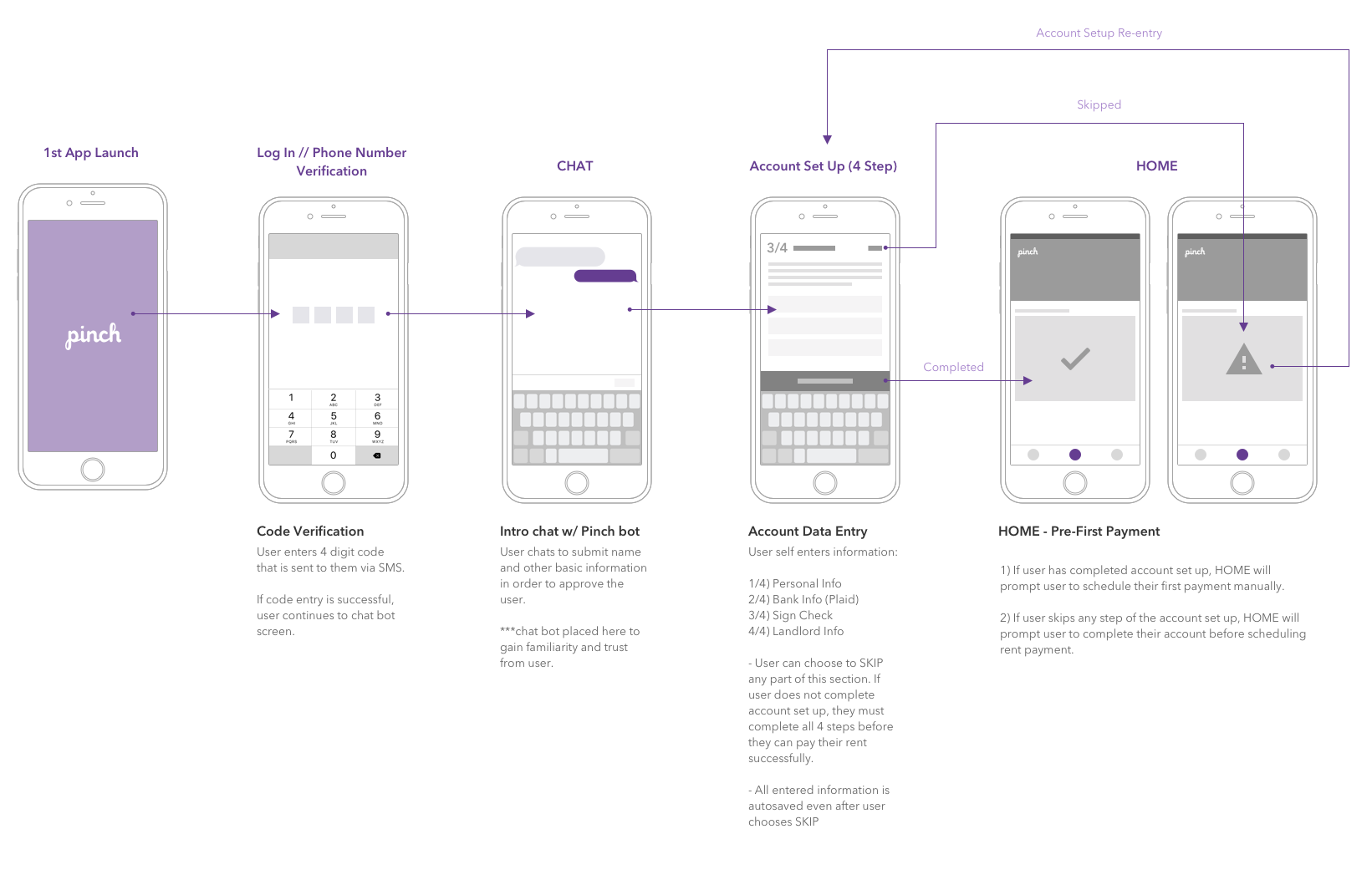
Multi-session account setup
The challenge
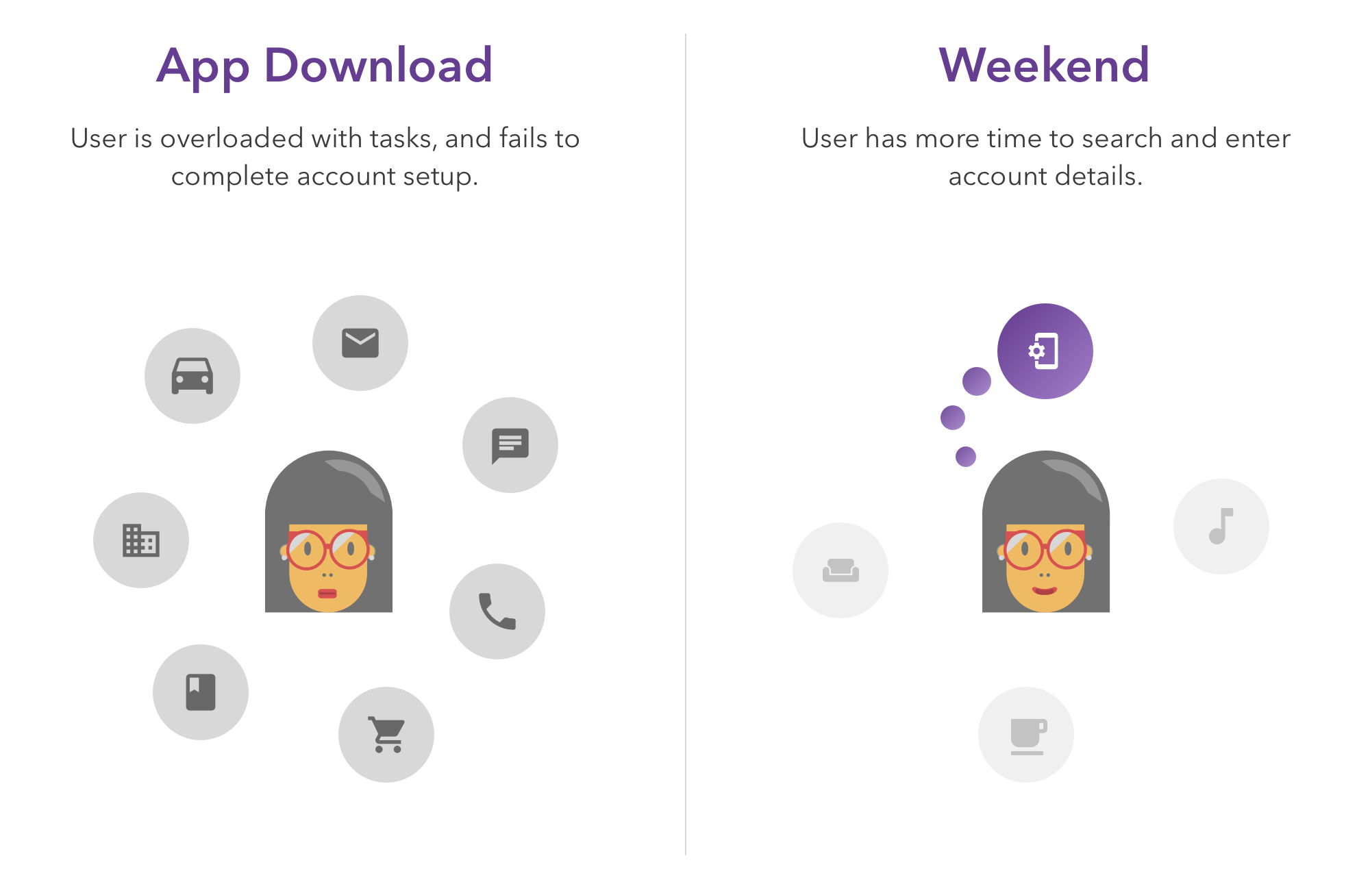
Users were downloading Pinch in moments their day couldn't support a full setup flow: on the bus, between meetings, during quick breaks. They didn't have all their information at hand (especially landlord details), and the original flow required everything upfront. Many abandoned the app and never came back.
The solution
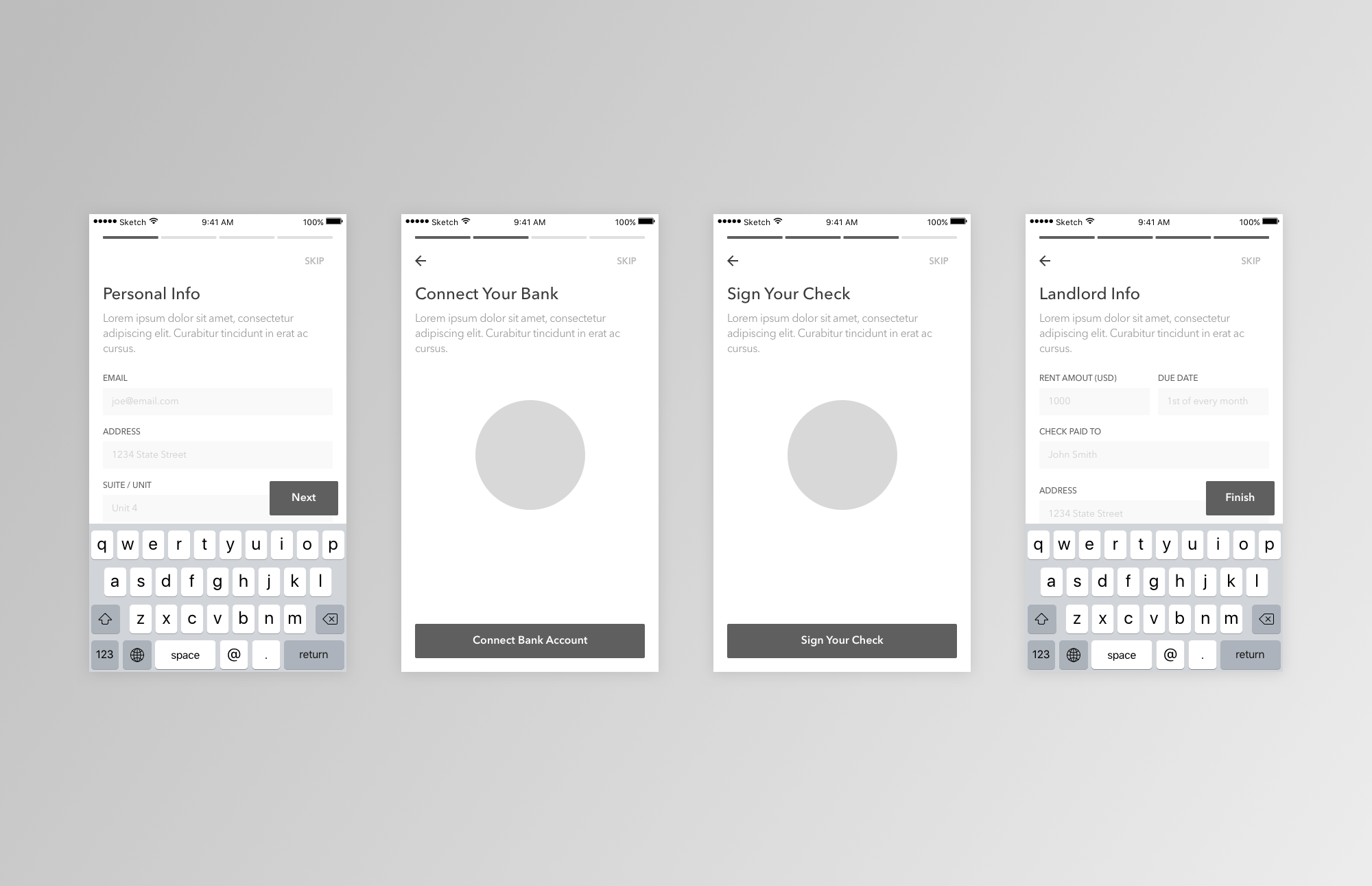
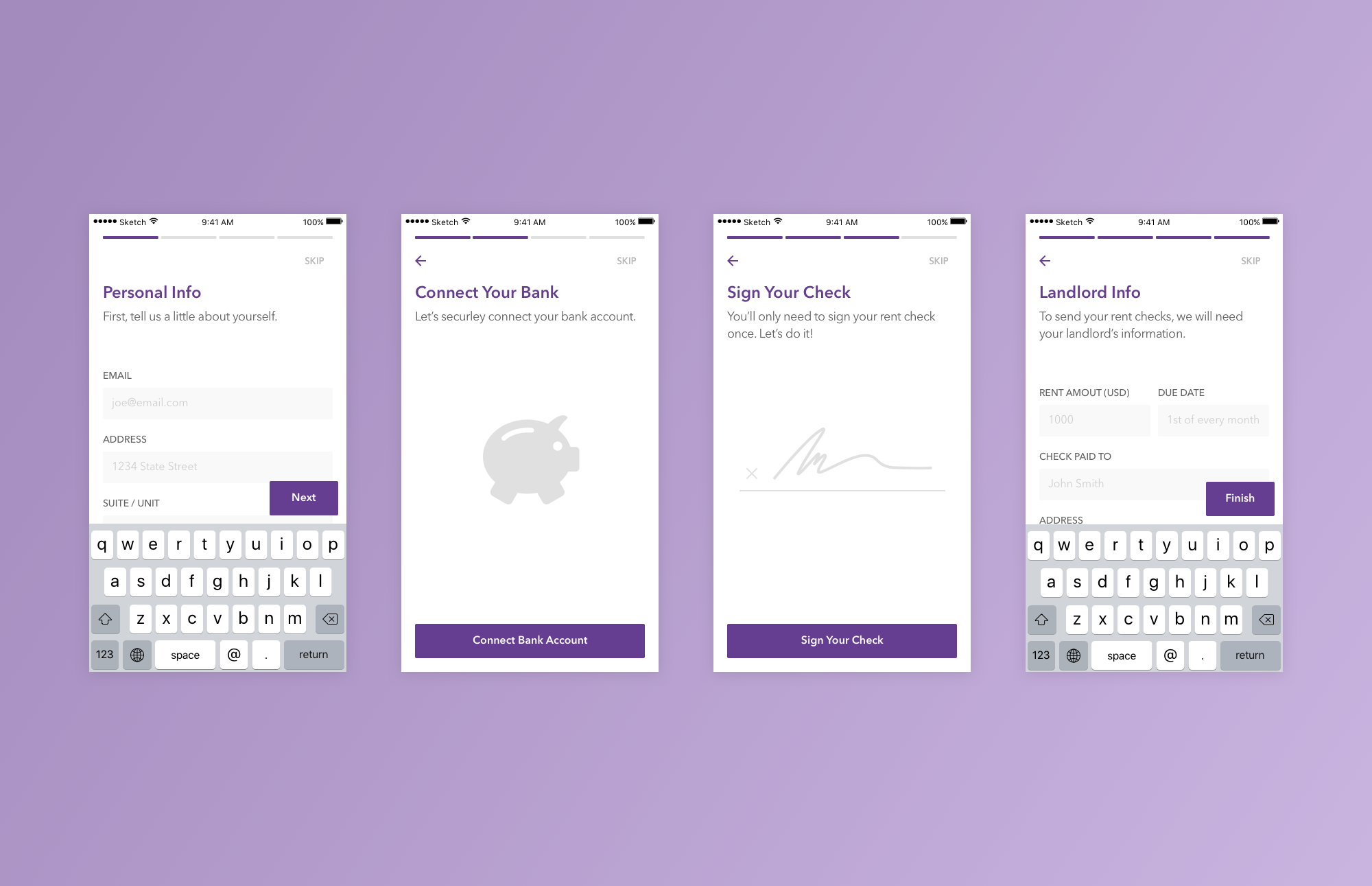
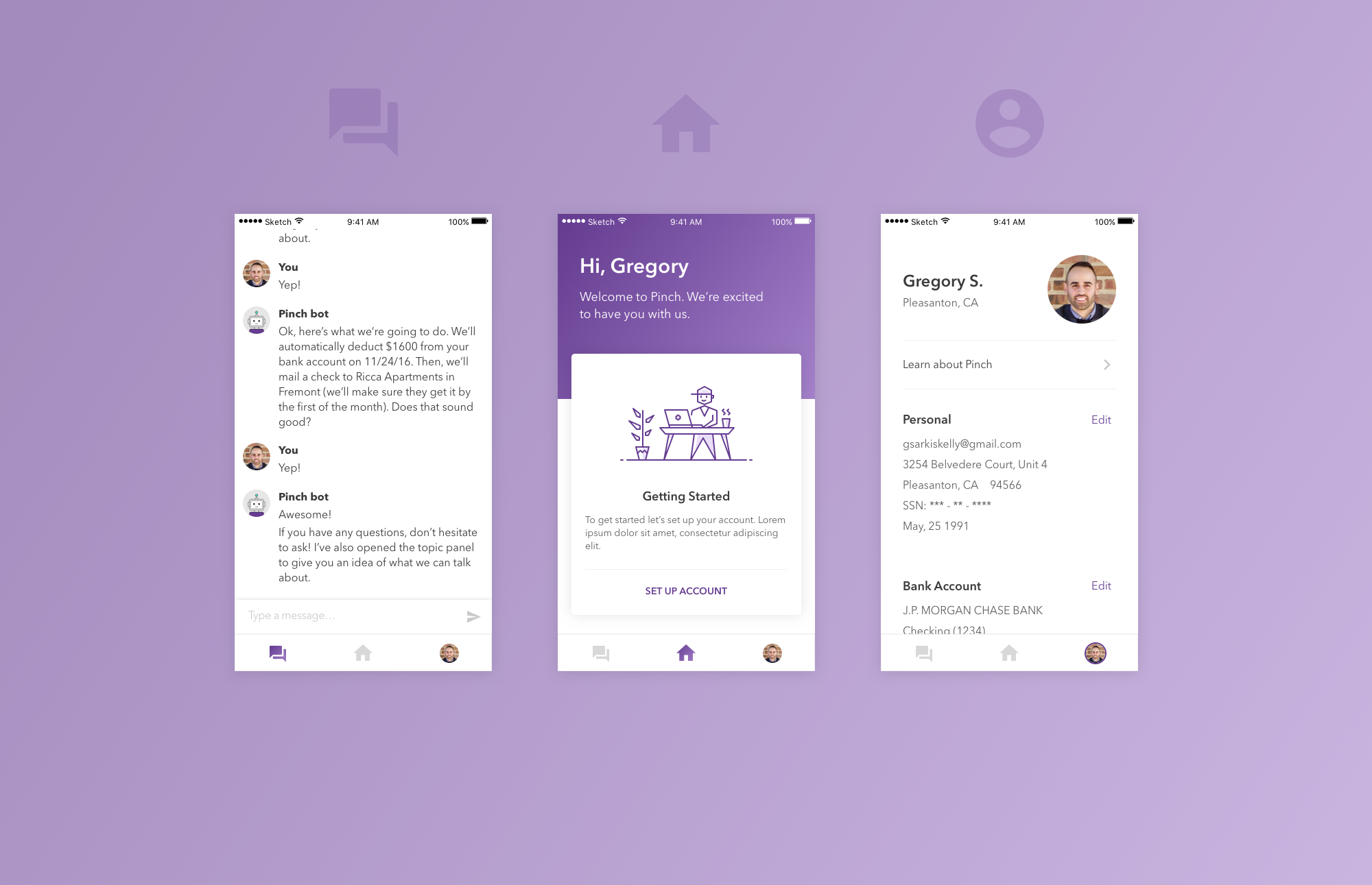
I broke account creation into four steps, each requiring a distinct type of information: Personal Info first (always at hand), Landlord Info last (the hardest to retrieve). Each step is a self-contained moment of progress, presented immediately on the home screen after download.
Critically, users can save partial progress and skip steps in any order. Someone who downloads on the bus can complete Personal Info, leave, and return that evening to finish Landlord Info, without losing what they'd already entered. The home screen surfaces the unfinished steps until everything is done.
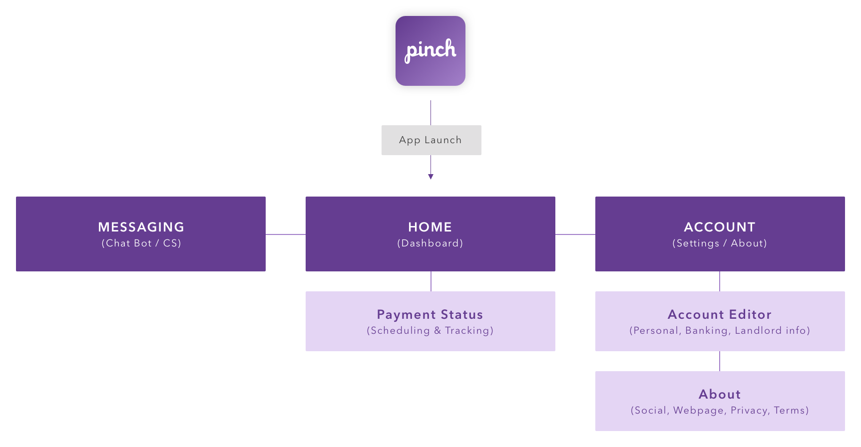
Restructuring IA for accessibility
The challenge
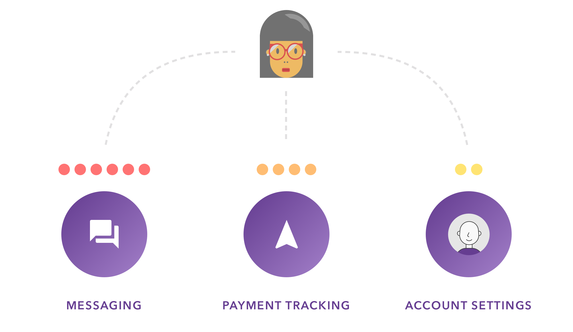
Analytics and customer support trends pointed to the same three features as both the most-requested and the hardest to find: messaging, payment status, and the account editor. Users were filing support tickets to ask where these lived, a clear sign the IA structure was actively obstructing task completion.
The solution
I introduced anchored navigation to surface the three highest-demand destinations at all times. Wherever a user was in the app, they could jump directly to messaging, payment status, or their account. No menus to dig through.
One key tradeoff worth calling out: the navigation bar is removed in flows where task-switching would be disruptive. During payment scheduling or account setup, distraction hurts more than it helps. Global navigation everywhere would have been simpler to ship, but worse for completion rates on the flows that mattered most.
Supporting timely payments
Two problems, one system
Once users were past setup and could navigate the app, the recurring monthly experience surfaced two distinct anxieties.
Remembering to pay. Monthly tasks are easy to forget, and rent is a high-stakes one to miss. Users ranked payment recollection as their #1 frustration in interviews.
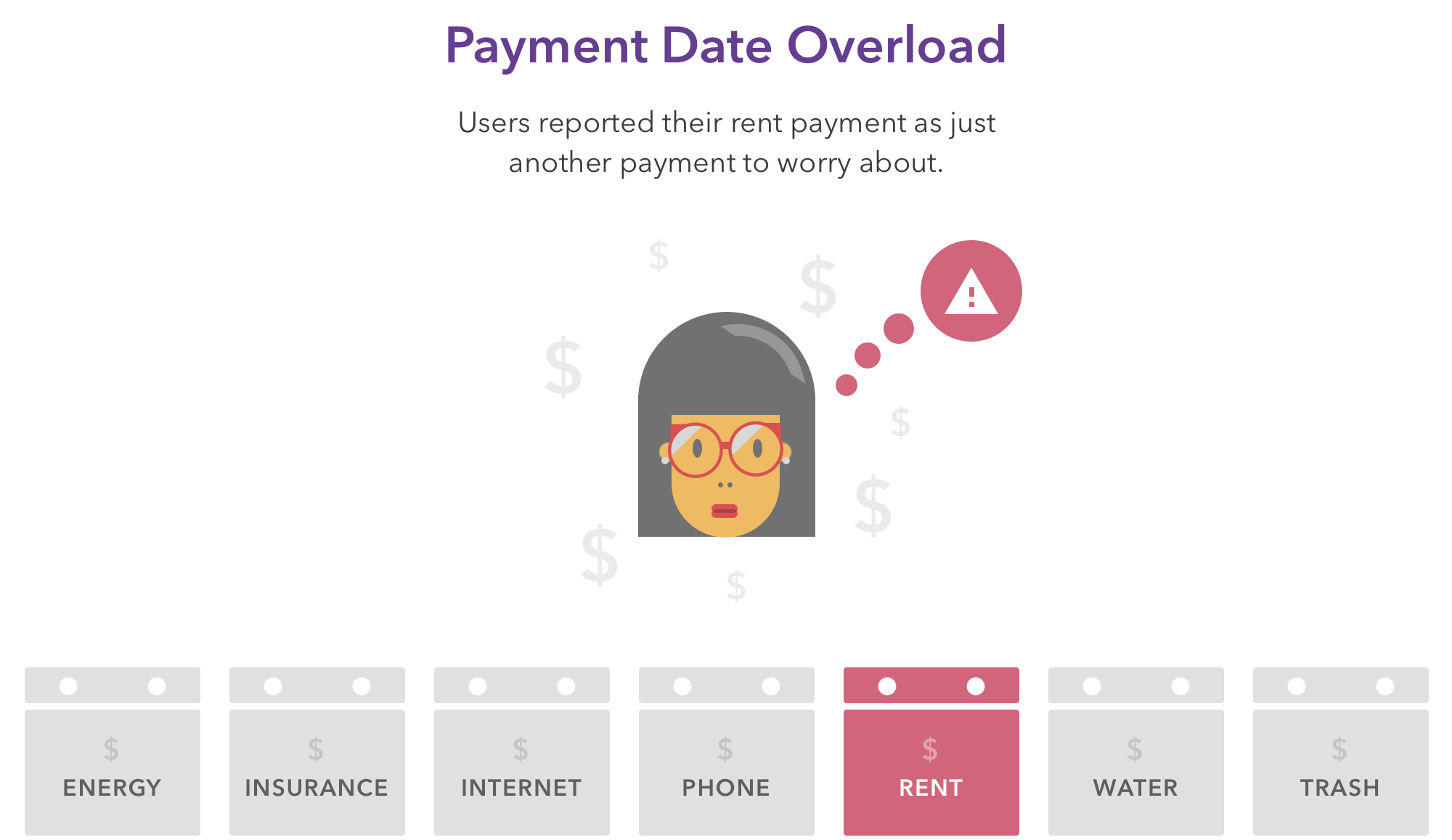
Tracking the payment after it left. Pinch's operations cycle still involved physical check delivery, a multi-day process. Users asked "where is my money?" with real worry, and support had no good answer beyond approximate timelines.
The solution
Two interlocking design decisions addressed both problems:
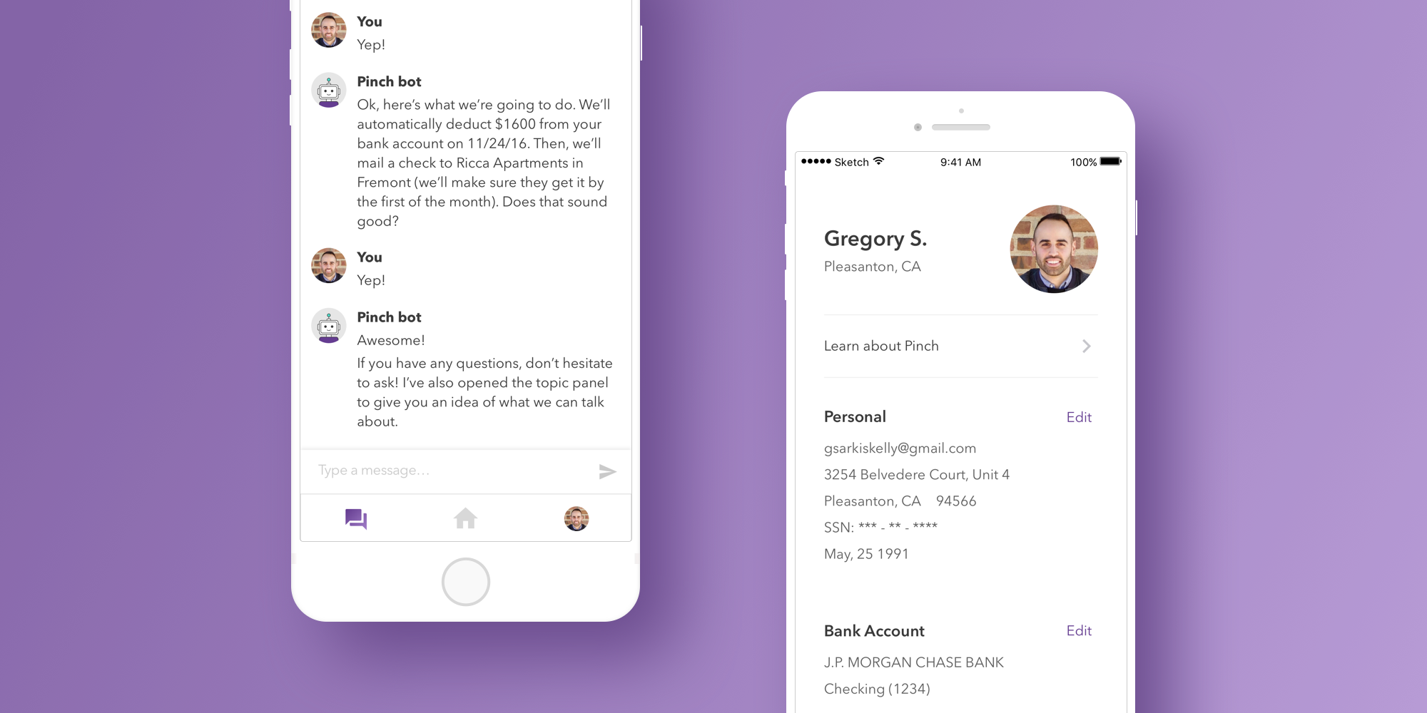
Auto-scheduling after the first manual payment. Users schedule their first rent payment manually from the home dashboard. This creates a sense of ownership and confirms the details are right. Every subsequent month auto-schedules from those settings, removing the recurring mental load. If life changes, users can pause or skip any month from the Payment Status screen.
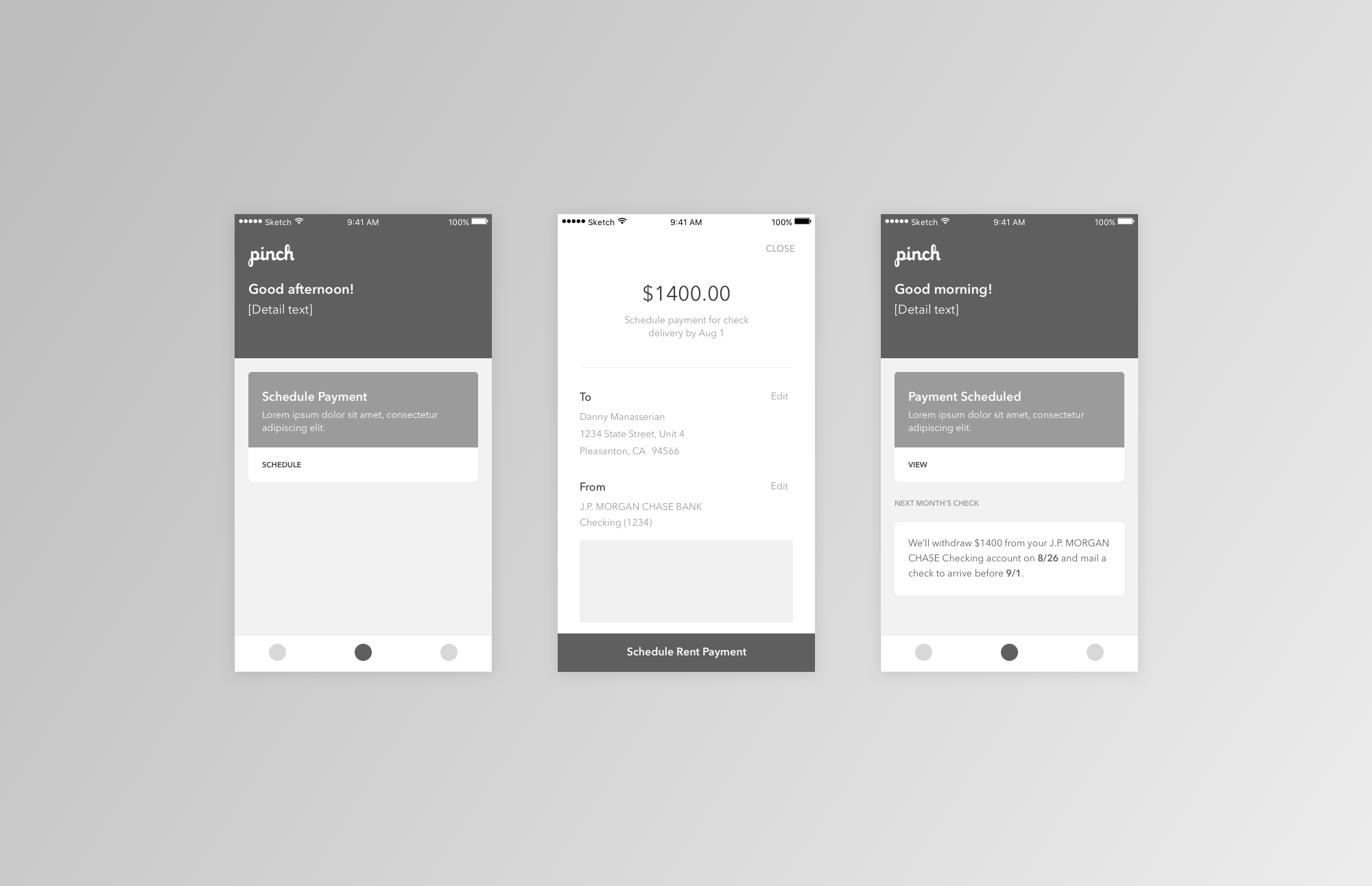
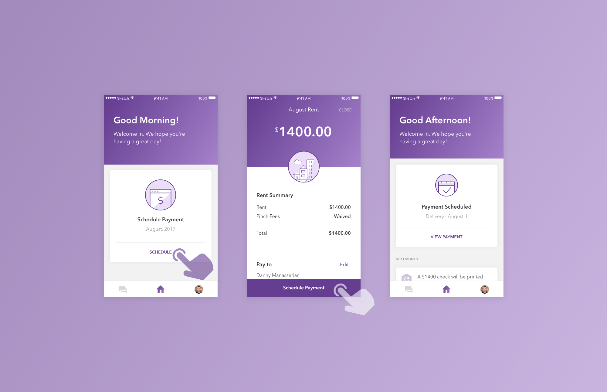
A notification spec covering the full check journey. From schedule confirmation through delivery and cashing, users get visibility into each stage. The Payment Status screen makes the same information available on-demand, turning "where is my money?" from anxiety into a quick check-in.
What this project reinforced
Working on Pinch reminded me that prioritization is the design. Faced with dozens of possible improvements, the most consequential decision was sequencing: fixing the funnel before the navigation, the navigation before the recurring flows. Each phase compounded on the one before, and getting that order right mattered more than any single screen.
It also reinforced the value of trusting existing research deeply. The team had done the work; my job was to translate it into design solutions. Going in with an instinct to run fresh research before designing anything would have cost weeks without adding meaningful new insight.
Pinch shipped the redesign across iOS and Android, and the team continues to build on the foundation we put in place.