Enterprise tools at Meta
Building the tools behind Meta's accessibility program
Led product design for a suite of enterprise tools at Meta, spanning an accessibility review tool, scorecard, and task integration that served teams across the company.
Meta's regulatory deadline
In 2025, the European Accessibility Act came into force. For Meta, this meant that products operating in Europe had to meet WCAG accessibility requirements, or parts of the business would face regulatory and legal consequences.
In order to meet that bar, the company needed to audit the accessibility of its entire product portfolio continuously and across every platform, and to turn the findings into work that thousands of people across product teams could own and resolve. No spreadsheet or manual process could operate at that scale, so the program needed purpose-built tools.
The accessibility program
Meta ran a company-wide program to review the accessibility of its products and drive fixes. Products were reviewed against a consistent set of accessibility standards, and the results flowed back to the teams that owned them so they could resolve issues and track their progress toward compliance.
I was the lead product designer for the tooling that powered the program. When I joined, the review process ran on a complex and error-prone spreadsheet workflow. Over the following years, I designed the product suite that replaced it, a set of connected tools serving three very different audiences, each with their own workflow, vocabulary, and stakes.
The product suite
Each tool in the suite solved a distinct problem for a distinct user. Together they served a single goal, increasing the accessibility of product experiences across Meta by making the review program more efficient, its findings more visible, and ownership of the work clear.
For review planners and accessibility specialists
01Review tool
The review tool is where accessibility reviews are set up, run, and recorded. Planners assemble a review from a product team's most important flows, specialists work through each one, and the issues they log become the data product teams act on to improve surface accessibility.
The tool had been in the works for over a year before I joined the effort. I designed, prototyped, and shipped the MVP in a single half, replacing the spreadsheet process entirely and eliminating the manual data movement and validation overhead that came with it. Review output scaled significantly from the very first weeks of use.
Greg's design was intuitive enough that the review teams needed almost no training to get started.
What I designed
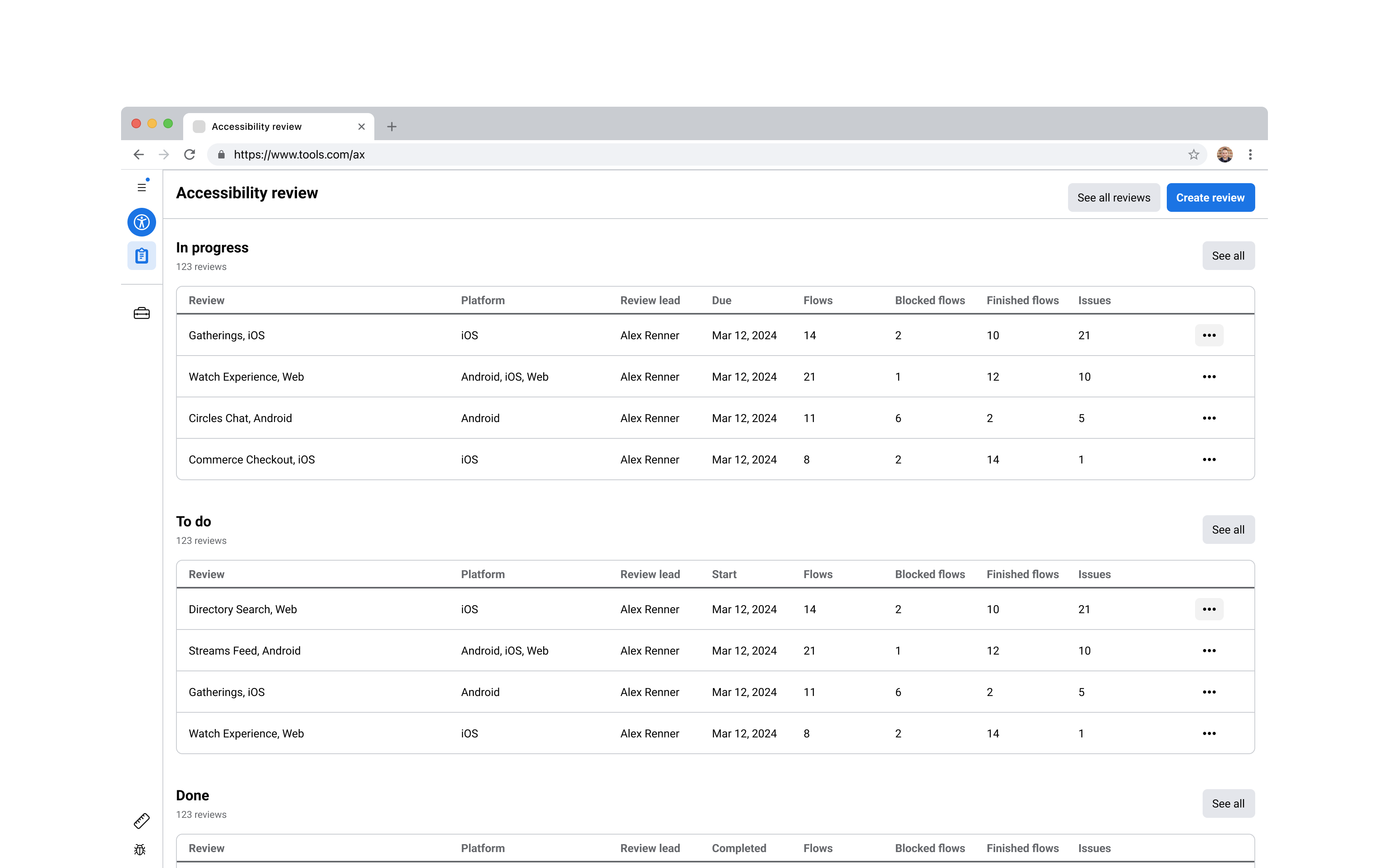
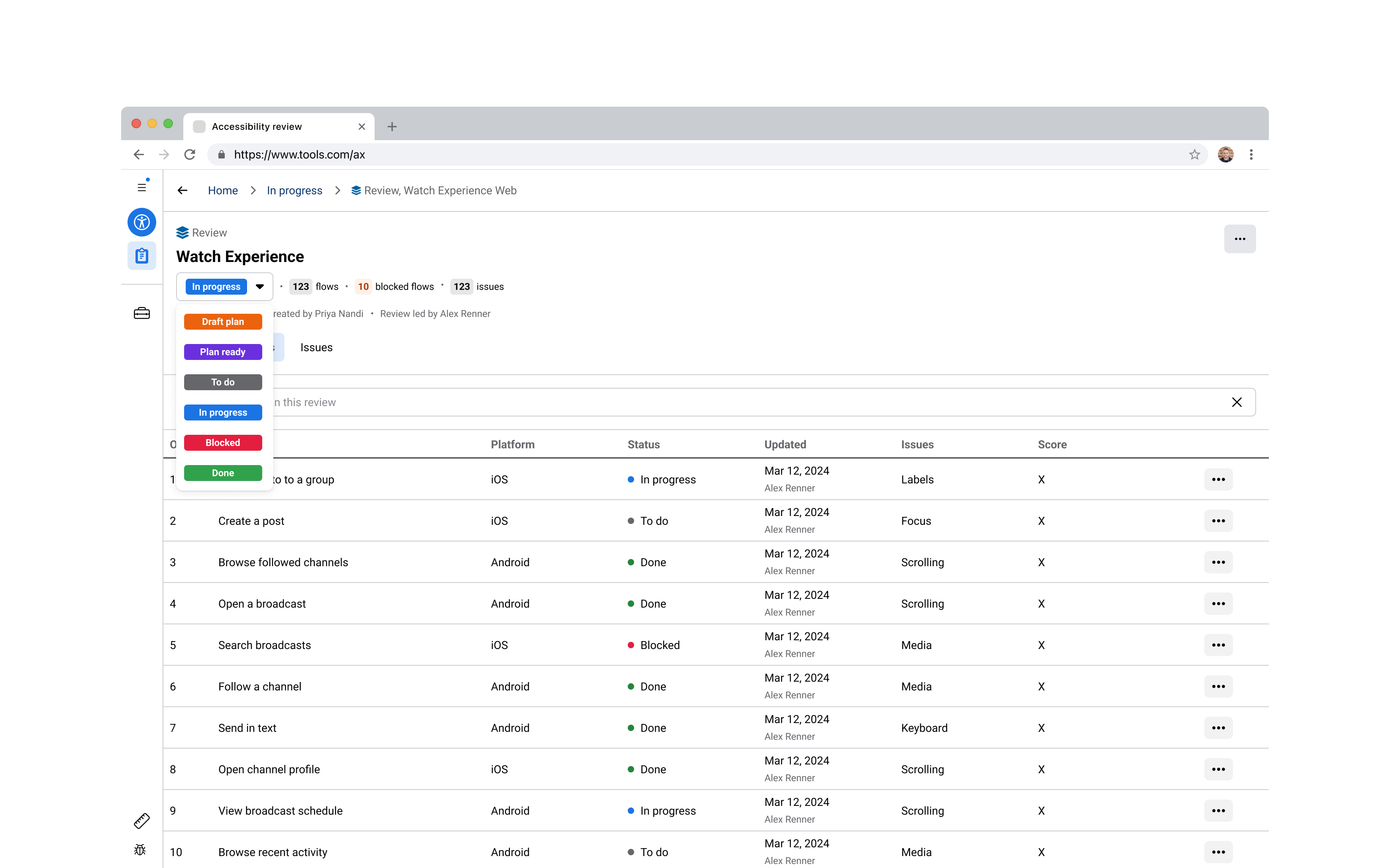
A review's status is what the accessibility program runs on. It tells a planner where a review is in the process, a reviewer whether a flow is ready to work on, and a product team when a review is complete and ready to act on. Requirements for review statuses had sat undefined for months, because every proposed model broke on edge cases in the review process that the team kept surfacing.
I ran working sessions with engineering and the program team to zoom out and map every stage a review could move through, rather than debating statuses as hypotheticals. Once we had a full picture of the review's journey, we could choose statuses based on the state of the review data and how actionable that data was for whoever needed to act on it next.
I designed six states across a planning phase and an execution phase. Review planners move a review from Draft plan to Plan ready, then specialists take it from To do to In progress to Done, with Blocked when work was held up. To reduce the status maintenance burden, I tied transitions to actions in the product, so assigning a review team advanced it automatically from Plan ready to To do.
With hundreds of reviews running at once, review teams needed status to lead the information architecture rather than sit as one more column in a table. Status then appeared only wherever it added clarity, most visibly on the home page, where reviews were grouped into tables by state so a reviewer could jump straight to the ones they needed, and it dropped out of single-status tables entirely.
Months of debate resolved in days, which unblocked engineering to build against a stable, team-defined model. More than that, the status model became the mental model users navigated by, so a planner thinking "show me everything in progress" could act on that thought directly. It made the review process faster to move through and lighter in cognitive load.
For product teams
02Scorecard
Accessibility review results only become useful when a product team can find their issues and understand what to fix. The scorecard gives every team at Meta a live, quantitative view of their product's accessibility, structured around the company's full product hierarchy, from an individual feature up to the company-wide picture.
I led the product requirements and early scoping, then designed the information architecture, the score visualizations, and the table patterns the tool runs on. The hard part was density, presenting thousands of review results so a team could see where they stood and know which issues to take on first. It replaced an earlier dashboard that had struggled with performance, reliability, and, ironically, accessibility.
What I designed
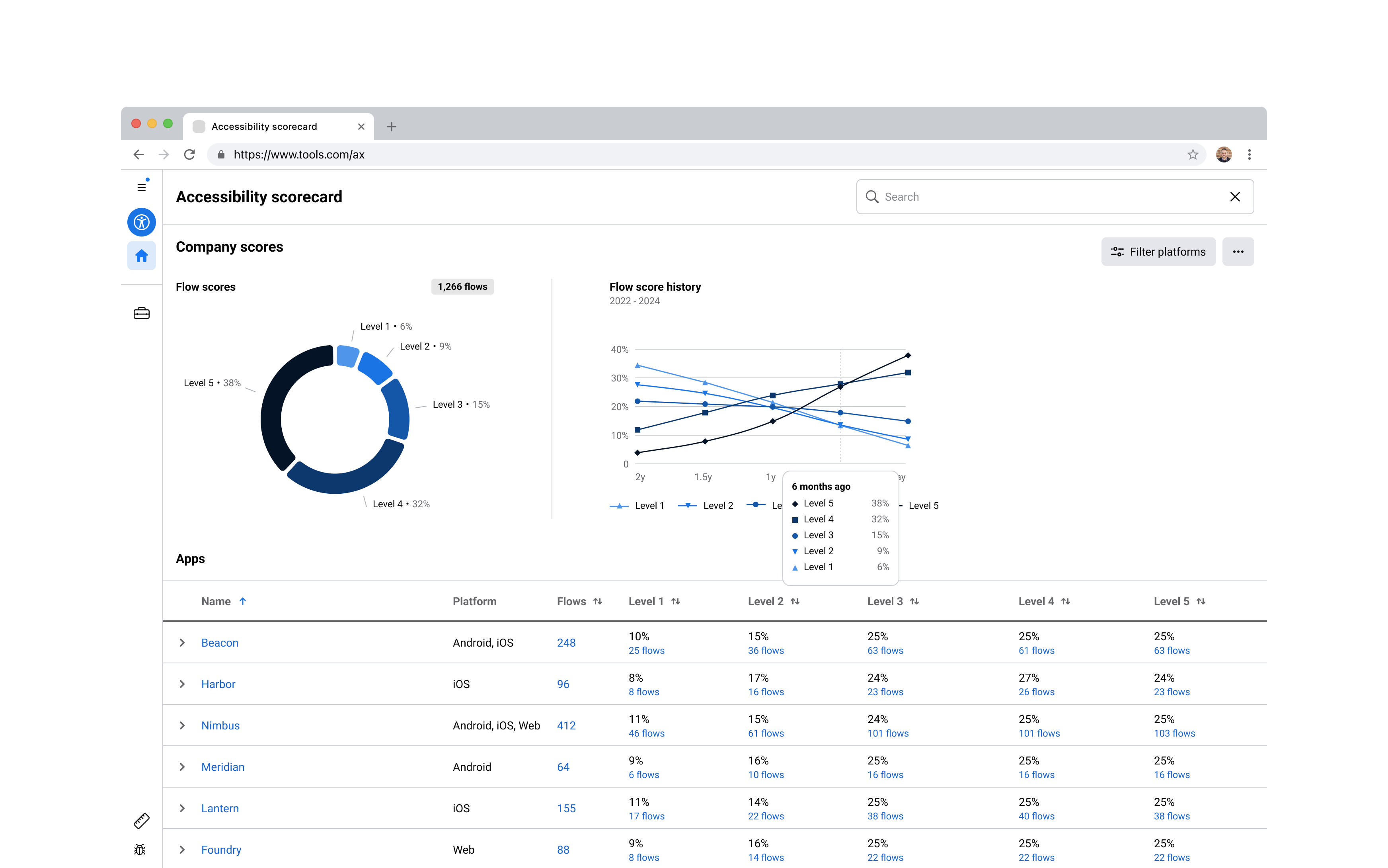
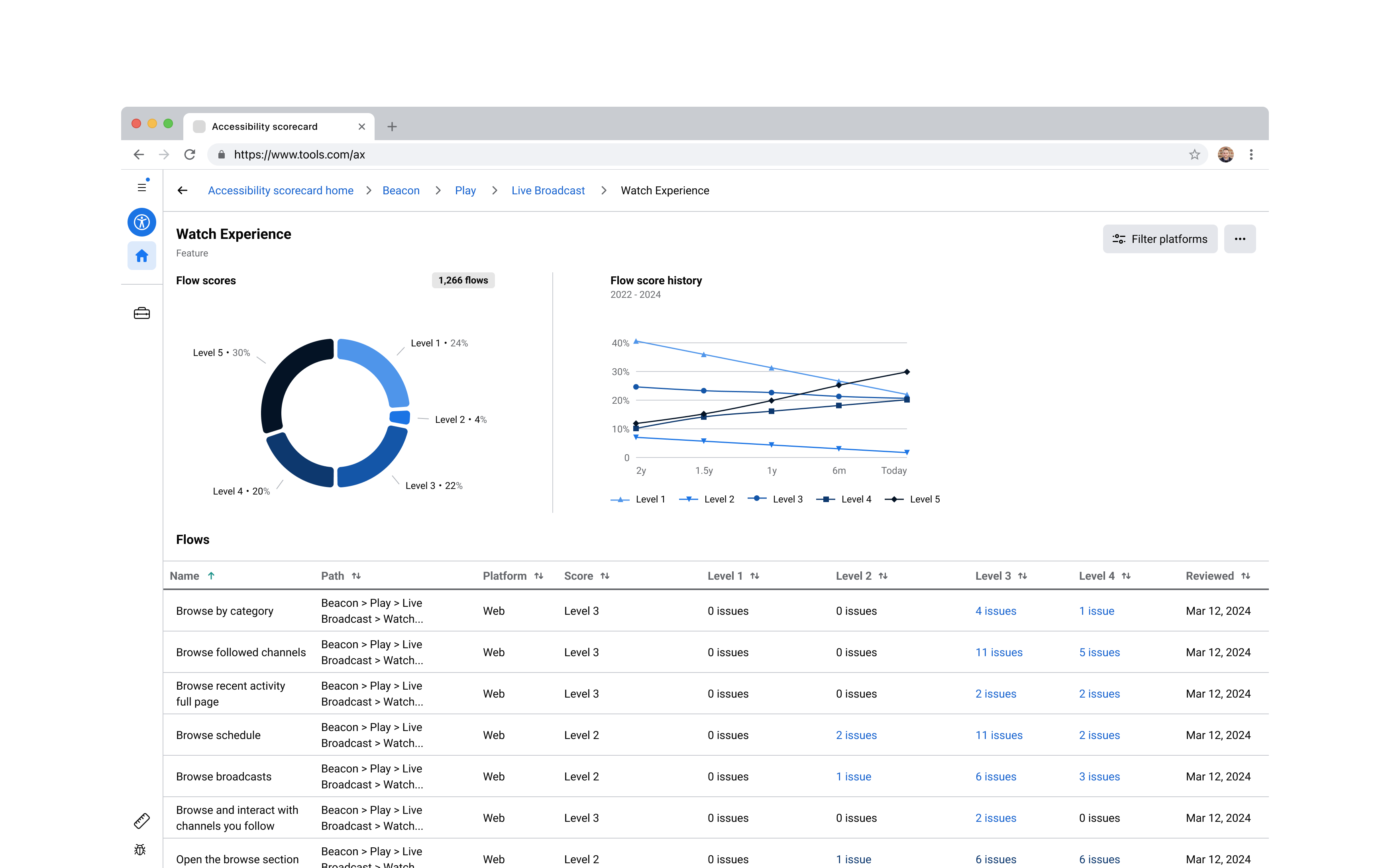
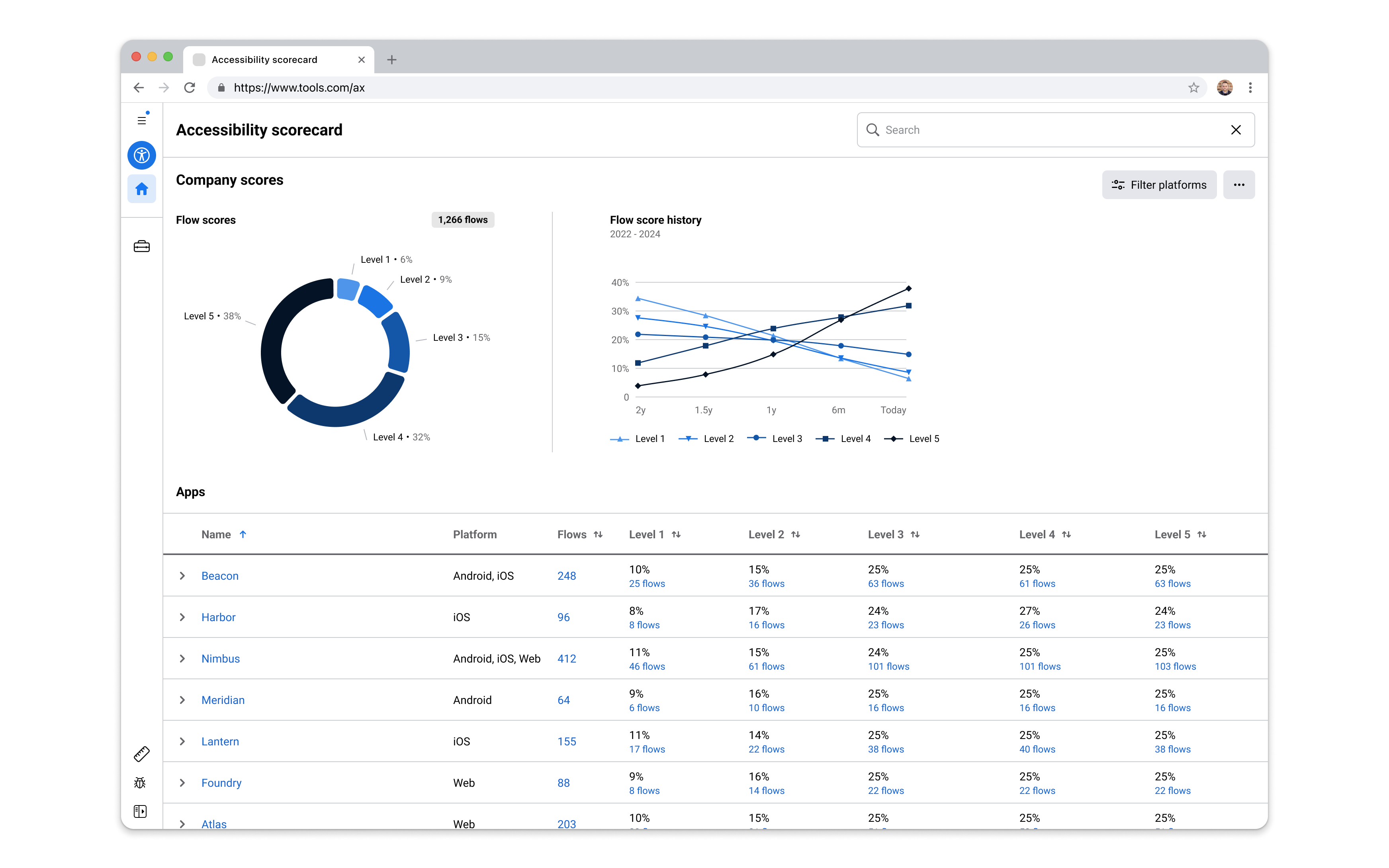
The scorecard had to answer two very different questions from the same data. A VP needed the current state and direction of an entire app, so they could report where accessibility stood and where it still had to get to. A product team needed to know which of their specific flows were failing and what to fix. One audience was scanning for direction, the other for a to-do list, and both had to find what they needed in the same tool.
I mapped the accessibility data onto the way the company was already organized, as a hierarchy running from the whole company down through app, product area, product, and feature, to the individual flows a review produced. The owner of each level asked a slightly different question, but underneath it was always the same one. Where does our accessibility stand now, how does that compare to where it has been, and what do we need to do to reach our goals? So I designed one view that answered that question at every level.
I designed one page to work at every level, from the whole company down to a single feature. I built it from three parts, a pie chart showing how the current level scores today, a history chart showing how it has moved over time, and a breakdown table showing what sits inside it, down to individual flows at the lowest level. That let leadership use the pie and history to see which parts of the organization needed to improve, while product teams used the table to act on their own flows. Because this was a tool for measuring accessibility, I designed it to meet WCAG requirements itself, so that anyone at Meta could use it.
One tool served every level of the company at once, from a VP tracking a whole app to the team fixing a single flow. More than that, it became the main tool the company used to steer toward its accessibility goal ahead of the European Accessibility Act. Leadership used it to see which parts of the organization were on track and which were falling behind, and product teams used it to plan and prioritize the work to get it done on time. It was the shared instrument that turned a company-wide regulatory deadline into specific, trackable next steps for the teams who had to meet it.
For the people fixing the issues
03Task integration
Every issue a specialist logs becomes a task someone has to own. The task integration was the work of building a plugin into Meta's existing task tool, so accessibility issues became structured, owned, trackable work sitting alongside a team's other tasks.
What I designed
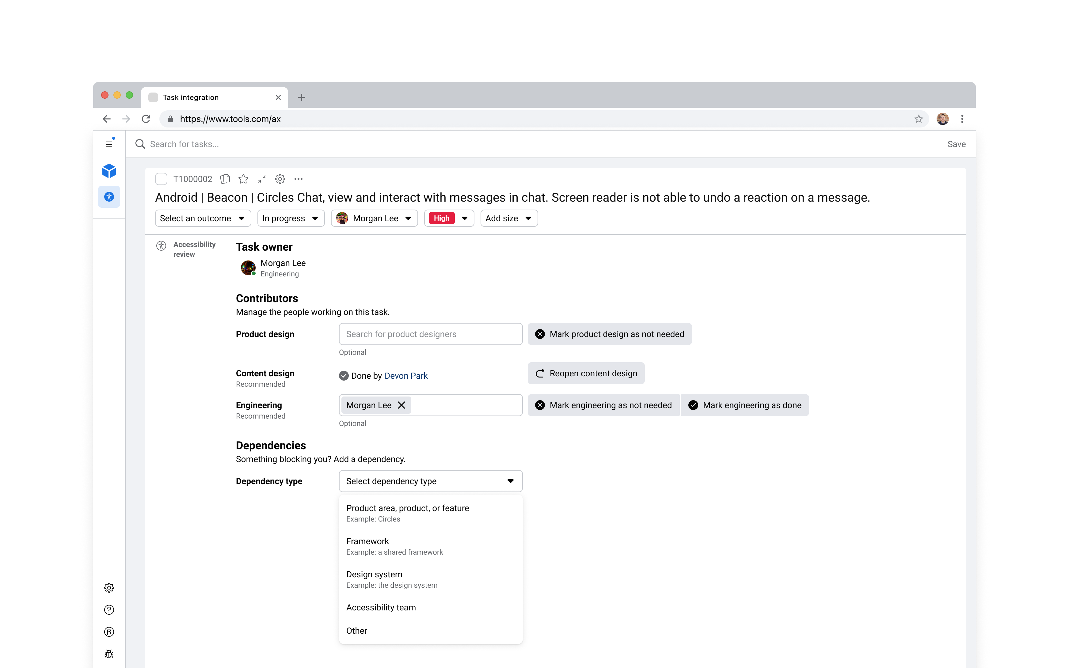
The original task design named an owner, but that owner was only a snapshot of who was actually needed in an accessibility fix. Tasks often need a product designer, a content designer, and an engineer working together. Sometimes a team could not fix a task at all, because the real cause lived in a framework, a design system, or another product entirely. The task tool captured none of that, naming one owner and leaving the rest undocumented.
Before designing anything, I sat down with the cross-functional team to model the data underneath the tool, because the plugin was only as good as its understanding of how tasks actually got resolved. We worked through which issue types required which roles, and documented the dependencies that came up again and again across the team's existing accessibility work. That let me design the plugin around what was really happening rather than around the task record as it already existed.
I designed the plugin to live inside the task itself, adding two things the task tool did not have. The first was a contributor section that captured every role a fix required, a product designer, a content designer, an engineer, each marked recommended or not needed. I designed the logic that set those roles automatically from the issue type, so a color-contrast issue arrived with a product designer recommended, and teams could adjust from there, with every contributor staying on record after the task closed. The second was a dependency system, so when the real cause belonged to a design system, a framework team, or another product, a team could hand the task to whoever could resolve it and it stopped counting against their score.
The plugin appeared on every task the program generated. Automatic role assignment put the right people on a task from the start, and the dependency system let teams hand off what was not theirs, so tasks moved forward instead of going stale in a backlog. What had been a heavy, manual lift for program managers became something teams could resolve on their own, and tasks closed faster as a result.
What made the work succeed
A few things shaped how the suite turned out, and without them the work could easily have gone the other way.
Leading without a PM. Because the suite never had a product manager, I led the definition of its problem statements, user stories, and requirements. I ran the workshops that brought the team together to resolve concepts that had not yet been defined, and I kept the roadmap honest as priorities shifted. There were frequent moments when a critical piece of the system stalled without alignment, whether a framework, a design, or a model we were working through. In those moments, I was the one who brought people together, established a shared direction, and kept the team moving toward our goal on schedule.
Designing with systems, not one-offs. As the single designer supporting a larger engineering team, I needed to produce design work quickly without sacrificing quality. So I leaned into building a set of reusable patterns that I used across the whole suite, including navigation, tables, and dialog forms. These patterns were built from the company's internal tooling design system components, which let me move quickly from established Figma sticker sheets and reinforced the consistency our users already expected across other internal tools. Where components failed to meet WCAG, my team and I flagged them and logged them to be resolved before going live.
Validated with end users. Every tool went through research with its actual users, from the review planners and specialists running reviews to the program managers and leaders tracking them and the teams across the company acting on the results. Ahead of each product release, I ran a dogfooding phase with a scoped window for users to try the tools and share feedback. What came back varied, and often included feedback that helped us iterate on the design and implement improvements before the wider release. The most substantial input came from the product teams, whose processes varied from team to team. Their feedback helped us find the patterns across those teams and adapt the tools to fit their processes, while maintaining consistency in the tools' core use cases.
Outcomes
Each tool solved a distinct problem for a distinct audience, and the program depended on all three. The review tool gave accessibility specialists a faster and more accurate way to assess how usable a product was, from a single flow up to an entire app. The scorecard turned those results into something legible at every altitude of the company, so that a VP, a manager, or an individual contributor could see how their surface was performing and what it would take to improve it. The task integration then moved that understanding into execution, putting each issue in front of the person who could resolve it. Each tool owned one stage of that arc, from reviewing to understanding to acting.
The MVP launched on time and met all of its goals, and in the year that followed the suite significantly scaled review capacity, extended coverage to enterprise products for the first time, and drove a substantial increase in the number of issues resolved and verified as fixed. In the long run, it became the measurement backbone for accessibility across Meta. In the years leading up to the European Accessibility Act, its review data was how product and design system teams across the company measured and closed accessibility issues ahead of the deadline. When the regulation took effect, Meta met its accessibility goals, and this tooling was how the company tracked its progress and knew when it had gotten there.
Launch
Shipped on time, meeting every program goal
Scale
Became the measurement backbone for accessibility across Meta
Regulation
Met European Accessibility Act goals across Meta
The full story of this work, including the decisions behind it and outcomes, will be available in interviews.
Reflection
The clearest lesson from this project was how much better and faster the work goes when you understand the people you are designing for, how they work, and what they need. We brought the team together early, listened to the people who would use the tools, and agreed on the jobs each of them needed to do. That let us build the right thing from the start.
The value of this work showed up in how little explanation the products needed. People were able to pick up the tools and use them, which came from many small decisions about accessibility, usability, and consistency we made along the way. Our small team shipped on time, thousands of people across the company worked in these tools, and the accessibility goals we set for the European Accessibility Act were met.
Every accessibility score that improved through these tools stood for a product someone could finally access and a task they could finally complete. That was the success that mattered the most, tools that let builders at Meta ship more accessible experiences to users across the globe.