
HINTER.CO
As funny content floods social media feeds, Hinter creates a new interactive medium to make people laugh. This is the story about my involvement and contribution to a mission of laughter.

My Role
I lead the UX strategy and design of Hinter’s iOS and Web App alongside the CEO, Product Manager, and Development Team in early 2014. Working within this team, I produced all UX/UI deliverables resulting in 7 App Store releases until early 2015.
Our Challenge
Everyday social media feeds fill with funny content to take the edge off our day – But where does it all come from? Our challenge was to better understand the UGC community, and to leverage a new interaction to traditionally passive content.
Hinter’s goal is to create a platform to allow users to create and consume interactive meme-like content to be shared everywhere.

Our Approach - Hinter’s Redesign
The executive vision for Hinter took inspiration from ‘flat’ web-ready comedic content (such as memes), and created a new content-medium by adding interaction to create engagement through surprise.
To differentiate ourselves in a trust-based community of comedians, we needed to establish a unique identity for the app to meet the needs of our users. The Hinter app enables our growing community to create, consume, and share a new medium of comedic content using a unique new interaction.
Discovery - Addressing Pain Points
The product discovery process began by better understanding user emotions and perspectives toward Hinter and entertainment products in general. By talking to our existing users we uncovered key user pain points that existed in the application, and began conversations regarding possible solutions to the following problems:
Onboarding Blocking Content
People looking to casually consume funny content are often reluctant to log in or create an account until the app has proven to be funny. User interviews showed most users would rather stick to an app they are accustomed to, than invest time in a new platform before they experience it’s content.
Quickly Finding the ‘Best’ Content
Because Hinter’s content is generated by the community, it is difficult and time consuming for users to sift through and find the best content. Users don't want to commit time searching when they could be laughing instead.
Sharing to Different Communities
It was almost unanimously reported that users wanted to share Hinter content with their external communities. As Hinter’s tap-to-reveal interaction is proprietary, innovations in our sharing tool was required to accommodate for successful small and large network sharing of Hinter content.
Meet The New Hinter App
Hinter’s mission is simple–to make people smile. The product redesign organizes the user experience into content channels, encourages community involvement through voting and commenting, and enables sharing to anywhere our users desire.

Instant Exposure to Top Content
At app launch, users now skip onboarding and are dropped directly into the content feed, where they view Staff Picked, Trending, and Recent content. This allows users to connect with our best content immediately, and helps them quickly form a positive connection within the first minute of use.

Community and Content Categories
To enable community engagement, commenting and voting are now available to encourage conversations and allow content to be prioritized in feeds. Using familiar content categories, users can now publish their Hints into a specific category to allow easier identification during navigation.

Sharing to Social and Private Channels
To fully enable sharing of Hinter content, users can now tag other users in commenting, share a link to view content via URL, or export Hints in video format. These three forms of sharing enable the proprietary hinter interaction to be consumed everywhere.
UX PROCESS
Understanding Existing and Potential Users
Through user research, two personas stood out as being power users with distinctively different expectations from the Hinter application. These personas were very important during product discussions, deciding feature sets, and in helping our team empathize with our users on general level.
Starting with Just the Right Features
By focusing on our goal to increase metrics on in-app engagement and sharing, our feature set was dictated by user pain points surrounding the enhancement of those metrics. The chosen features were highly dependent on Effort (including development cost) v. Impact (for users) of each feature. The following chart allowed us to visualize each feature and come to a decision on which were most useful for the initial redesign.
Optimizing Flows for Quick Session Lengths
From data and feedback collected from user interviews regarding session length and frequency, I redesigned the user experience to reflect quick and satisfying sessions, with a target average session length of 40 seconds. This experience required quick access to content, specific content categories for discovery, and constant updates to content feeds.
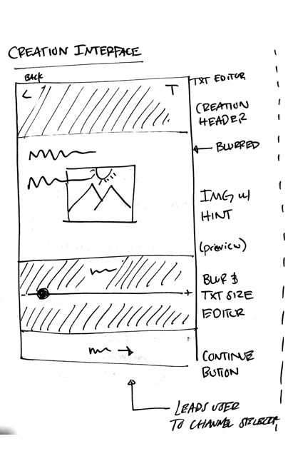
Sketching to Wireframes
I began the implemented design process by sketching key screens along the user flows. Our immediate goal with sketching was to explore different layouts for consuming and organizing content. Once the team agreed on sketched layouts I quickly wireframed screens to get them in front of users. To test wireframes for usability, designs were prototyped with InVision and given users to validate the experience. After collecting user feedback on the InVision prototype, revisions were made before finishing each UX sprint.


VISUAL DESIGN & BRANDING
Moodboarding Inspires Comedic Edge
As Hinter’s mechanic contains many of the same functional similarities to a stand-up joke (set-up and punchline) our creative direction took inspiration from progressive forms of witty pictures, iconography, typeface, and color.

Emotional Design Elements
By focusing on the funny, sarcastic, and crude emotional elements within the comedic style in our moodboard, I designed channel iconography with emotional sentiment to guide content creation toward the specific emotion in each channel. To keep content organized, and easy to navigate, darker colors of black and grey used were used to direct the focus toward navigation when necessary.


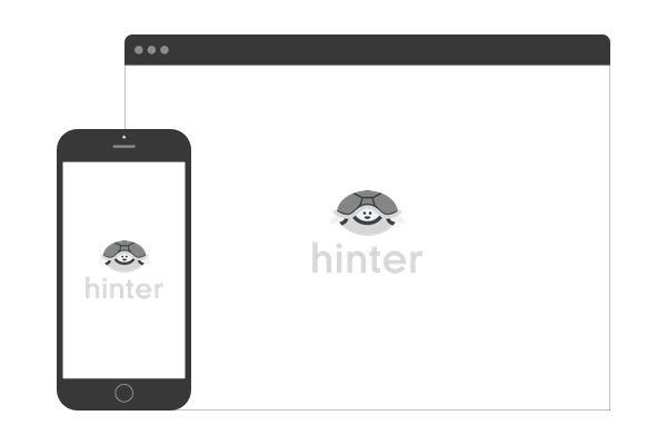
Lean Desktop Interface for Sharing
To enable growth through link-sharing to non-video supported websites (such as Reddit), we created a lean web platform to give non native-app users access to our content when shared. Through light user interviews we confirmed web user experience should focus less on exploration and more on individual hint engagement. User flows were assembled for the website to better understand how users will reach and interact with the content online, and helped our team understand the best placement for ‘download app’ CTAs. The overall focus of the Hinter web platform was to attract users to the hint mechanic, and convert them to mobile app users for further content consumption.
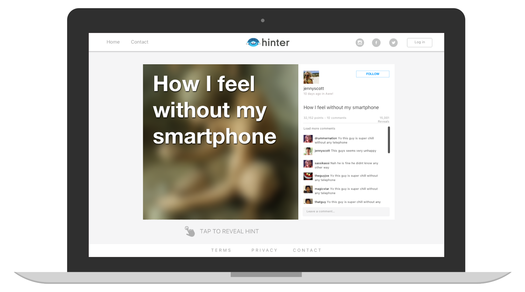
web interface
Modular Design Keeps Experience Consistent
I approached Hinter’s web design with an MVP mindset in order to keep development cost low and scope creep to a minimum. To ensure the experience was consistent between both native app and web interfaces I applied modular elements from the iOS application to the web interface. These consistencies in design were created to accelerate workflow with our development team, and create comfort for users viewing content on both platforms.

Modular Design, Mobile to web


